M. M. Hamza, E. Ullah, A. Baggag, H. Bensmail, M. Sedlmair, and M. Aupetit, “ClustML: A measure of cluster pattern complexity in scatterplots learnt from human-labeled groupings,”
Information Visualization, vol. 23, no. 2, Art. no. 2, 2024, doi:
10.1177/14738716231220536.
Abstract
Visual quality measures (VQMs) are designed to support analysts by automatically detecting and quantifying patterns in visualizations. We propose a new VQM for visual grouping patterns in scatterplots, called ClustML, which is trained on previously collected human subject judgments. Our model encodes scatterplots in the parametric space of a Gaussian Mixture Model and uses a classifier trained on human judgment data to estimate the perceptual complexity of grouping patterns. The numbers of initial mixture components and final combined groups quantify visual cluster patterns in scatterplots. It improves on existing VQMs, first, by better estimating human judgments on two-Gaussian cluster patterns and, second, by giving higher accuracy when ranking general cluster patterns in scatterplots. We use it to analyze kinship data for genome-wide association studies, in which experts rely on the visual analysis of large sets of scatterplots. We make the benchmark datasets and the new VQM available for practical use and further improvements.BibTeX
M. M. Abbas, E. Ullah, A. Baggag, H. Bensmail, M. Sedlmair, and M. Aupetit, “ClustRank: a Visual Quality Measure Trained on Perceptual Data for Sorting Scatterplots by Cluster Patterns,” Information Visualization, 2024.
Abstract
Visual quality measures (VQMs) are designed to support analysts by automatically detecting and quantifying patterns in visualizations. We propose a new VQM for visual grouping patterns in scatterplots, called ClustML, which is trained on previously collected human subject judgments. Our model encodes scatterplots in the parametric space of a Gaussian Mixture Model and uses a classifier trained on human judgment data to estimate the perceptual complexity of grouping patterns. The numbers of initial mixture components and final combined groups. It improves on existing VQMs, first, by better estimating human judgments on two-Gaussian cluster patterns and, second, by giving higher accuracy when ranking general cluster patterns in scatterplots. We use it to analyze kinship data for genome-wide association studies, in which experts rely on the visual analysis of large sets of scatterplots. We make the benchmark datasets and the new VQM available for practical use and further improvements.BibTeX
C. Morariu, A. Bibal, R. Cutura, B. Frénay, and M. Sedlmair, “Predicting User Preferences of Dimensionality Reduction Embedding Quality,”
IEEE Transactions on Visualization and Computer Graphics, vol. 29, no. 1, Art. no. 1, 2023, doi:
10.1109/TVCG.2022.3209449.
Abstract
A plethora of dimensionality reduction techniques have emerged over the past decades, leaving researchers and analysts with a wide variety of choices for reducing their data, all the more so given some techniques come with additional hyper-parametrization (e.g., t-SNE, UMAP, etc.). Recent studies are showing that people often use dimensionality reduction as a black-box regardless of the specific properties the method itself preserves. Hence, evaluating and comparing 2D embeddings is usually qualitatively decided, by setting embeddings side-by-side and letting human judgment decide which embedding is the best. In this work, we propose a quantitative way of evaluating embeddings, that nonetheless places human perception at the center. We run a comparative study, where we ask people to select “good” and “misleading” views between scatterplots of low-dimensional embeddings of image datasets, simulating the way people usually select embeddings. We use the study data as labels for a set of quality metrics for a supervised machine learning model whose purpose is to discover and quantify what exactly people are looking for when deciding between embeddings. With the model as a proxy for human judgments, we use it to rank embeddings on new datasets, explain why they are relevant, and quantify the degree of subjectivity when people select preferred embeddings.BibTeX
Abstract
We study the question of how visual analysis can support the comparison of spatio-temporal ensemble data of liquid and gas flow in porous media.
To this end, we focus on a case study, in which nine different research groups concurrently simulated the process of injecting CO2 into the subsurface.
We explore different data aggregation and interactive visualization approaches to compare and analyze these nine simulations.
In terms of data aggregation, one key component is the choice of similarity metrics that define the relationship between different simulations.
We test different metrics and find that using the machine-learning model “S4” (tailored to the present study) as metric provides the best visualization results.
Based on that, we propose different visualization methods.
For overviewing the data, we use dimensionality reduction methods that allow us to plot and compare the different simulations in a scatterplot.
To show details about the spatio-temporal data of each individual simulation, we employ a space-time cube volume rendering.
All views support linking and brushing interaction to allow users to select and highlight subsets of the data simultaneously across multiple views.
We use the resulting interactive, multi-view visual analysis tool to explore the nine simulations and also to compare them to data from experimental setups.
Our main findings include new insights into ranking of simulation results with respect to experimental data, and the development of gravity fingers in simulations.BibTeX
K.-T. Chen
et al., “Reading Strategies for Graph Visualizations That Wrap Around in Torus Topology,” in
Proceedings of the 2023 Symposium on Eye Tracking Research and Applications, in Proceedings of the 2023 Symposium on Eye Tracking Research and Applications. Tubingen, Germany: Association for Computing Machinery, 2023. doi:
10.1145/3588015.3589841.
Abstract
We investigate reading strategies for node-link diagrams that wrap around the boundaries in a flattened torus topology by examining eye tracking data recorded in a previous controlled study. Prior work showed that torus drawing affords greater flexibility in clutter reduction than traditional node-link representations, but impedes link-and-path exploration tasks, while repeating tiles around boundaries aids comprehension. However, it remains unclear what strategies users apply in different wrapping settings. This is important for design implications for future work on more effective wrapped visualizations for network applications, and cyclic data that could benefit from wrapping. We perform visual-exploratory data analysis of gaze data, and conduct statistical tests derived from the patterns identified. Results show distinguishable gaze behaviors, with more visual glances and transitions between areas of interest in the non-replicated layout. Full-context has more successful visual searches than partial-context, but the gaze allocation indicates that the layout could be more space-efficient.BibTeX
T. Ge
et al., “Optimally Ordered Orthogonal Neighbor Joining Trees for Hierarchical Cluster Analysis,”
IEEE Transactions on Visualization and Computer Graphics, pp. 1–13, 2023, doi:
10.1109/TVCG.2023.3284499.
Abstract
We propose to use optimally ordered orthogonal neighbor-joining (O 3 NJ) trees as a new way to visually explore cluster structures and outliers in multi-dimensional data. Neighbor-joining (NJ) trees are widely used in biology, and their visual representation is similar to that of dendrograms. The core difference to dendrograms, however, is that NJ trees correctly encode distances between data points, resulting in trees with varying edge lengths. We optimize NJ trees for their use in visual analysis in two ways. First, we propose to use a novel leaf sorting algorithm that helps users to better interpret adjacencies and proximities within such a tree. Second, we provide a new method to visually distill the cluster tree from an ordered NJ tree. Numerical evaluation and three case studies illustrate the benefits of this approach for exploring multi-dimensional data in areas such as biology or image analysis.BibTeX
F. Heyen, Q. Q. Ngo, and M. Sedlmair, “Visual Overviews for Sheet Music Structure,” in
Proceedings of the 24th International Society for Music Information Retrieval Conference (ISMIR) 2023, in Proceedings of the 24th International Society for Music Information Retrieval Conference (ISMIR) 2023. Nov. 2023, pp. 692--699. doi:
doi.org/10.48550/arXiv.2308.06140.
Abstract
We propose different methods for alternative representation and visual augmentation of sheet music that help users gain an overview of general structure, repeating patterns, and the similarity of segments. To this end, we explored mapping the overall similarity between sections or bars to colors. For these mappings, we use dimensionality reduction or clustering to assign similar segments to similar colors and vice versa. To provide a better overview, we further designed simplified music notation representations, including hierarchical and compressed encodings. These overviews allow users to display whole pieces more compactly on a single screen without clutter and to find and navigate to distant segments more quickly. Our preliminary evaluation with guitarists and tablature shows that our design supports users in tasks such as analyzing structure, finding repetitions, and determining the similarity of specific segments to others.BibTeX
N. Doerr, K. Angerbauer, M. Reinelt, and M. Sedlmair, “Bees, Birds and Butterflies: Investigating the Influence of Distractors on Visual Attention Guidance Techniques,” in
Extended Abstracts of the 2023 CHI Conference on Human Factors in Computing Systems, in Extended Abstracts of the 2023 CHI Conference on Human Factors in Computing Systems. Hamburg, Germany: Association for Computing Machinery, 2023. doi:
10.1145/3544549.3585816.
Abstract
Visual attention guidance methods direct the viewer’s gaze in immersive environments by visually highlighting elements of interest. The highlighting can be done, for instance, by adding a colored circle around elements, adding animated swarms (HiveFive), or removing objects from one eye in a stereoscopic display (Deadeye). We contribute a controlled user experiment (N=30) comparing these three techniques under the influence of visual distractors, such as bees flying by. Our results show that Circle and HiveFive performed best in terms of task performance and qualitative feedback, and were largely robust against different levels of distractions. Furthermore, we discovered a high mental demand for Deadeye.BibTeX
S. Dosdall, K. Angerbauer, L. Merino, M. Sedlmair, and D. Weiskopf, “Toward In-Situ Authoring of Situated Visualization with Chorded Keyboards,” in
15th International Symposium on Visual Information Communication and Interaction, VINCI 2022, Chur, Switzerland, August 16-18, 2022, M. Burch, G. Wallner, and D. Limberger, Eds., in 15th International Symposium on Visual Information Communication and Interaction, VINCI 2022, Chur, Switzerland, August 16-18, 2022. ACM, 2022, pp. 1–5. doi:
10.1145/3554944.3554970.
Abstract
Authoring situated visualizations in-situ is challenging due to the need of writing code in a mobile and highly dynamic fashion. To provide better support for that, we define requirements for text input methods that target situated visualization authoring. We identify wearable chorded keyboards as a potentially suitable method that fulfills some of these requirements. To further investigate this approach, we tailored a chorded keyboard device to visualization authoring, developed a learning application, and conducted a pilot user study. Our results confirm that learning a high number of chords is the main barrier for adoption, as in other application areas. Based on that, we discuss ideas on how chorded keyboards with a strongly reduced alphabet, hand gestures, and voice recognition might be used as a viable, multi-modal support for authoring situated visualizations in-situ.BibTeX
K. Angerbauer and M. Sedlmair, “Toward Inclusion and Accessibility in Visualization Research: Speculations on Challenges, Solution Strategies, and Calls for Action (Position Paper),” in
2022 IEEE Evaluation and Beyond - Methodological Approaches for Visualization (BELIV), in 2022 IEEE Evaluation and Beyond - Methodological Approaches for Visualization (BELIV). Oct. 2022, pp. 20–27. doi:
10.1109/BELIV57783.2022.00007.
Abstract
Inclusion and accessibility in visualization research have gained increasing attention in recent years. However, many challenges still remain to be solved on the road toward a more inclusive, shared-experience-driven visualization design and evaluation process. In this position paper, we discuss challenges and speculate about potential solutions, based on related work, our own research, as well as personal experiences. The goal of this paper is to start discussions on the role of accessibility and inclusion in visualization design and evaluation.BibTeX
M. Abdelaal, N. D. Schiele, K. Angerbauer, K. Kurzhals, M. Sedlmair, and D. Weiskopf, “Comparative Evaluation of Bipartite, Node-Link, and Matrix-Based Network Representations,”
IEEE Transactions on Visualization and Computer Graphics, pp. 1–11, 2022, doi:
10.1109/TVCG.2022.3209427.
Abstract
This work investigates and compares the performance of node-link diagrams, adjacency matrices, and bipartite layouts for visualizing networks. In a crowd-sourced user study (n = 150), we measure the task accuracy and completion time of the three representations for different network classes and properties. In contrast to the literature, which covers mostly topology-based tasks (e.g., path finding) in small datasets, we mainly focus on overview tasks for large and directed networks. We consider three overview tasks on networks with 500 nodes: (T1) network class identification, (T2) cluster detection, and (T3) network density estimation, and two detailed tasks: (T4) node in-degree vs. out-degree and (T5) representation mapping, on networks with 50 and 20 nodes, respectively. Our results show that bipartite layouts are beneficial for revealing the overall network structure, while adjacency matrices are most reliable across the different tasks.BibTeX
Q. Q. Ngo, F. L. Dennig, D. A. Keim, and M. Sedlmair, “Machine Learning Meets Visualization – Experiences and Lessons Learned,”
it - Information Technology, vol. 64, no. 4–5, Art. no. 4–5, 2022, doi:
doi:10.1515/itit-2022-0034.
Abstract
In this article, we discuss how Visualization (VIS) with Machine Learning (ML) could mutually benefit from each other. We do so through the lens of our own experience working at this intersection for the last decade. Particularly we focus on describing how VIS supports explaining ML models and aids ML-based Dimensionality Reduction techniques in solving tasks such as parameter space analysis. In the other direction, we discuss approaches showing how ML helps improve VIS, such as applying ML-based automation to improve visualization design. Based on the examples and our own perspective, we describe a number of open research challenges that we frequently encountered in our endeavors to combine ML and VIS.BibTeX
G. Richer, A. Pister, M. Abdelaal, J.-D. Fekete, M. Sedlmair, and D. Weiskopf, “Scalability in Visualization,”
IEEE Transactions on Visualization and Computer Graphics, pp. 1–15, 2022, doi:
10.1109/TVCG.2022.3231230.
Abstract
We introduce a conceptual model for scalability designed for visualization research. With this model, we systematically analyze over 120 visualization publications from 1990 to 2020 to characterize the different notions of scalability in these works. While many papers have addressed scalability issues, our survey identifies a lack of consistency in the use of the term in the visualization research community. We address this issue by introducing a consistent terminology meant to help visualization researchers better characterize the scalability aspects in their research. It also helps in providing multiple methods for supporting the claim that a work is “scalable.” Our model is centered around an effort function with inputs and outputs. The inputs are the problem size and resources, whereas the outputs are the actual efforts, for instance, in terms of computational run time or visual clutter. We select representative examples to illustrate different approaches and facets of what scalability can mean in visualization literature. Finally, targeting the diverse crowd of visualization researchers without a scalability tradition, we provide a set of recommendations for how scalability can be presented in a clear and consistent way to improve fair comparison between visualization techniques and systems and foster reproducibility.BibTeX
K. Klein, M. Sedlmair, and F. Schreiber, “Immersive Analytics: An Overview,”
it - Information Technology, vol. 64, no. 4–5, Art. no. 4–5, 2022, doi:
doi:10.1515/itit-2022-0037.
Abstract
Immersive Analytics is concerned with the systematic examination of the benefits and challenges of using immersive environments for data analysis, and the development of corresponding designs that improve the quality and efficiency of the analysis process. While immersive technologies are now broadly available, practical solutions haven’t received broad acceptance in real-world applications outside of several core areas, and proper guidelines on the design of such solutions are still under development. Both fundamental research and applications bring together topics and questions from several fields, and open a wide range of directions regarding underlying theory, evidence from user studies, and practical solutions tailored towards the requirements of application areas. We give an overview on the concepts, topics, research questions, and challenges.BibTeX
P. Fleck, A. Sousa Calepso, S. Hubenschmid, M. Sedlmair, and D. Schmalstieg, “RagRug: A Toolkit for Situated Analytics,”
IEEE Transactions on Visualization and Computer Graphics, 2022, doi:
10.1109/TVCG.2022.3157058.
Abstract
We present RagRug, an open-source toolkit for situated analytics. The abilities of RagRug go beyond previous immersive analytics toolkits by focusing on specific requirements emerging when using augmented reality (AR) rather than virtual reality. RagRug combines state of the art visual encoding capabilities with a comprehensive physical-virtual model, which lets application developers systematically describe the physical objects in the real world and their role in AR. We connect AR visualization with data streams from the Internet of Things using distributed dataflow. To this aim, we use reactive programming patterns so that visualizations become context-aware, i.e., they adapt to events coming in from the environment. The resulting authoring system is low-code; it emphasises describing the physical and the virtual world and the dataflow between the elements contained therein. We describe the technical design and implementation of RagRug, and report on five example applications illustrating the toolkit's abilities.BibTeX
K. Angerbauer
et al., “Accessibility for Color Vision Deficiencies: Challenges and Findings of a Large Scale Study on Paper Figures,” in
Proceedings of the 2022 CHI Conference on Human Factors in Computing Systems, in Proceedings of the 2022 CHI Conference on Human Factors in Computing Systems. New Orleans, LA, USA: Association for Computing Machinery, 2022. doi:
10.1145/3491102.3502133.
Abstract
We present an exploratory study on the accessibility of images in publications when viewed with color vision deficiencies (CVDs). The study is based on 1,710 images sampled from a visualization dataset (VIS30K) over five years. We simulated four CVDs on each image. First, four researchers (one with a CVD) identified existing issues and helpful aspects in a subset of the images. Based on the resulting labels, 200 crowdworkers provided 30,000 ratings on present CVD issues in the simulated images. We analyzed this data for correlations, clusters, trends, and free text comments to gain a first overview of paper figure accessibility. Overall, about 60 % of the images were rated accessible. Furthermore, our study indicates that accessibility issues are subjective and hard to detect. On a meta-level, we reflect on our study experience to point out challenges and opportunities of large-scale accessibility studies for future research directions.BibTeX
K. Lu
et al., “Palettailor: Discriminable Colorization for Categorical Data,”
IEEE Transactions on Visualization & Computer Graphics, vol. 27, no. 02, Art. no. 02, 2021, doi:
10.1109/TVCG.2020.3030406.
Abstract
We present an integrated approach for creating and assigning color palettes to different visualizations such as multi-class scatterplots, line, and bar charts. While other methods separate the creation of colors from their assignment, our approach takes data characteristics into account to produce color palettes, which are then assigned in a way that fosters better visual discrimination of classes. To do so, we use a customized optimization based on simulated annealing to maximize the combination of three carefully designed color scoring functions: point distinctness, name difference, and color discrimination. We compare our approach to state-of-the-art palettes with a controlled user study for scatterplots and line charts, furthermore we performed a case study. Our results show that Palettailor, as a fully-automated approach, generates color palettes with a higher discrimination quality than existing approaches. The efficiency of our optimization allows us also to incorporate user modifications into the color selection process.BibTeX
C. Krauter, J. Vogelsang, A. S. Calepso, K. Angerbauer, and M. Sedlmair, “Don’t Catch It: An Interactive Virtual-Reality Environment to Learn About COVID-19 Measures Using Gamification Elements,” in
Mensch und Computer, in Mensch und Computer. ACM, 2021, pp. 593--596. doi:
10.1145/3473856.3474031.
Abstract
The world is still under the influence of the COVID-19 pandemic. Even though vaccines are deployed as rapidly as possible, it is still necessary to use other measures to reduce the spread of the virus. Measures such as social distancing or wearing a mask receive a lot of criticism. Therefore, we want to demonstrate a serious game to help the players understand these measures better and show them why they are still necessary. The player of the game has to avoid other agents to keep their risk of a COVID-19 infection low. The game uses Virtual Reality through a Head-Mounted-Display to deliver an immersive and enjoyable experience. Gamification elements are used to engage the user with the game while they explore various environments. We also implemented visualizations that help the user with social distancing.BibTeX
C. Morariu, A. Bibal, R. Cutura, B. Frenay, and M. Sedlmair, “DumbleDR: Predicting User Preferences of Dimensionality Reduction Projection Quality,” arXiv preprint, Technical Report arXiv:2105.09275, 2021. [Online]. Available:
https://arxiv.org/abs/2105.09275Abstract
A plethora of dimensionality reduction techniques have emerged over the past decades, leaving researchers and analysts with a wide variety of choices for reducing their data, all the more so given some techniques come with additional parametrization (e.g. t-SNE, UMAP, etc.). Recent studies are showing that people often use dimensionality reduction as a black-box regardless of the specific properties the method itself preserves. Hence, evaluating and comparing 2D projections is usually qualitatively decided, by setting projections side-by-side and letting human judgment decide which projection is the best. In this work, we propose a quantitative way of evaluating projections, that nonetheless places human perception at the center. We run a comparative study, where we ask people to select 'good' and 'misleading' views between scatterplots of low-level projections of image datasets, simulating the way people usually select projections. We use the study data as labels for a set of quality metrics whose purpose is to discover and quantify what exactly people are looking for when deciding between projections. With this proxy for human judgments, we use it to rank projections on new datasets, explain why they are relevant, and quantify the degree of subjectivity in projections selected.BibTeX
G. J. Rijken
et al., “Illegible Semantics: Exploring the Design Space of Metal Logos,” in
IEEE VIS alt.VIS Workshop, in IEEE VIS alt.VIS Workshop. 2021. [Online]. Available:
https://arxiv.org/abs/2109.01688Abstract
The logos of metal bands can be by turns gaudy, uncouth, or nearly illegible. Yet, these logos work: they communicate sophisticated notions of genre and emotional affect. In this paper we use the design considerations of metal logos to explore the space of "illegible semantics": the ways that text can communicate information at the cost of readability, which is not always the most important objective. In this work, drawing on formative visualization theory, professional design expertise, and empirical assessments of a corpus of metal band logos, we describe a design space of metal logos and present a tool through which logo characteristics can be explored through visualization. We investigate ways in which logo designers imbue their text with meaning and consider opportunities and implications for visualization more widely.BibTeX
N. Grossmann, J. Bernard, M. Sedlmair, and M. Waldner, “Does the Layout Really Matter? A Study on Visual Model Accuracy Estimation,” in
IEEE Visualization Conference (VIS, Short Paper), in IEEE Visualization Conference (VIS, Short Paper). 2021, pp. 61--65. doi:
10.1109/VIS49827.2021.9623326.
Abstract
In visual interactive labeling, users iteratively assign labels to data items until the machine model reaches an acceptable accuracy. A crucial step of this process is to inspect the model's accuracy and decide whether it is necessary to label additional elements. In scenarios with no or very little labeled data, visual inspection of the predictions is required. Similarity-preserving scatterplots created through a dimensionality reduction algorithm are a common visualization that is used in these cases. Previous studies investigated the effects of layout and image complexity on tasks like labeling. However, model evaluation has not been studied systematically. We present the results of an experiment studying the influence of image complexity and visual grouping of images on model accuracy estimation. We found that users outperform traditional automated approaches when estimating a model's accuracy. Furthermore, while the complexity of images impacts the overall performance, the layout of the items in the plot has little to no effect on estimations.BibTeX
J. Bernard, M. Hutter, M. Sedlmair, M. Zeppelzauer, and T. Munzner, “A Taxonomy of Property Measures to Unify Active Learning and Human-centered Approaches to Data Labeling,”
ACM Transactions on Interactive Intelligent Systems (TiiS), vol. 11, no. 3–4, Art. no. 3–4, 2021, doi:
10.1145/3439333.
Abstract
Strategies for selecting the next data instance to label, in service of generating labeled data for machine learning, have been considered separately in the machine learning literature on active learning and in the visual analytics literature on human-centered approaches. We propose a unified design space for instance selection strategies to support detailed and fine-grained analysis covering both of these perspectives. We identify a concise set of 15 properties, namely measureable characteristics of datasets or of machine learning models applied to them, that cover most of the strategies in these literatures. To quantify these properties, we introduce Property Measures (PM) as fine-grained building blocks that can be used to formalize instance selection strategies. In addition, we present a taxonomy of PMs to support the description, evaluation, and generation of PMs across four dimensions: machine learning (ML) Model Output, Instance Relations, Measure Functionality, and Measure Valence. We also create computational infrastructure to support qualitative visual data analysis: a visual analytics explainer for PMs built around an implementation of PMs using cascades of eight atomic functions. It supports eight analysis tasks, covering the analysis of datasets and ML models using visual comparison within and between PMs and groups of PMs, and over time during the interactive labeling process. We iteratively refined the PM taxonomy, the explainer, and the task abstraction in parallel with each other during a two-year formative process, and show evidence of their utility through a summative evaluation with the same infrastructure. This research builds a formal baseline for the better understanding of the commonalities and differences of instance selection strategies, which can serve as the stepping stone for the synthesis of novel strategies in future work.BibTeX
R. Cutura, C. Morariu, Z. Cheng, Y. Wang, D. Weiskopf, and M. Sedlmair, “Hagrid — Gridify Scatterplots with Hilbert and Gosper Curves,” in
The 14th International Symposium on Visual Information Communication and Interaction, in The 14th International Symposium on Visual Information Communication and Interaction. Potsdam, Germany: Association for Computing Machinery, 2021, p. 1:1—1:8. doi:
10.1145/3481549.3481569.
Abstract
A common enhancement of scatterplots represents points as small multiples, glyphs, or thumbnail images. As this encoding often results in overlaps, a general strategy is to alter the position of the data points, for instance, to a grid-like structure. Previous approaches rely on solving expensive optimization problems or on dividing the space that alter the global structure of the scatterplot. To find a good balance between efficiency and neighborhood and layout preservation, we propose Hagrid, a technique that uses space-filling curves (SFCs) to “gridify” a scatterplot without employing expensive collision detection and handling mechanisms. Using SFCs ensures that the points are plotted close to their original position, retaining approximately the same global structure. The resulting scatterplot is mapped onto a rectangular or hexagonal grid, using Hilbert and Gosper curves. We discuss and evaluate the theoretic runtime of our approach and quantitatively compare our approach to three state-of-the-art gridifying approaches, DGrid, Small multiples with gaps SMWG, and CorrelatedMultiples CMDS, in an evaluation comprising 339 scatterplots. Here, we compute several quality measures for neighborhood preservation together with an analysis of the actual runtimes. The main results show that, compared to the best other technique, Hagrid is faster by a factor of four, while achieving similar or even better quality of the gridified layout. Due to its computational efficiency, our approach also allows novel applications of gridifying approaches in interactive settings, such as removing local overlap upon hovering over a scatterplot.BibTeX
Abstract
Abstract After a long period of scepticism, more and more publications describe basic research but also practical approaches to how abstract data can be presented in immersive environments for effective and efficient data understanding. Central aspects of this important research question in immersive analytics research are concerned with the use of 3D for visualization, the embedding in the immersive space, the combination with spatial data, suitable interaction paradigms and the evaluation of use cases. We provide a characterization that facilitates the comparison and categorization of published works and present a survey of publications that gives an overview of the state of the art, current trends, and gaps and challenges in current research.BibTeX
J. Bernard, M. Hutter, M. Zeppelzauer, M. Sedlmair, and T. Munzner, “ProSeCo: Visual analysis of class separation measures and dataset characteristics,”
Computers & Graphics, vol. 96, pp. 48–60, 2021, doi:
https://doi.org/10.1016/j.cag.2021.03.004.
Abstract
Class separation is an important concept in machine learning and visual analytics. We address the visual analysis of class separation measures for both high-dimensional data and its corresponding projections into 2D through dimensionality reduction (DR) methods. Although a plethora of separation measures have been proposed, it is difficult to compare class separation between multiple datasets with different characteristics, multiple separation measures, and multiple DR methods. We present ProSeCo, an interactive visualization approach to support comparison between up to 20 class separation measures and up to 4 DR methods, with respect to any of 7 dataset characteristics: dataset size, dataset dimensions, class counts, class size variability, class size skewness, outlieriness, and real-world vs. synthetically generated data. ProSeCo supports (1) comparing across measures, (2) comparing high-dimensional to dimensionally-reduced 2D data across measures, (3) comparing between different DR methods across measures, (4) partitioning with respect to a dataset characteristic, (5) comparing partitions for a selected characteristic across measures, and (6) inspecting individual datasets in detail. We demonstrate the utility of ProSeCo in two usage scenarios, using datasets 1 posted at https://osf.io/epcf9/.BibTeX
M. Kraus, K. Klein, J. Fuchs, D. A. Keim, F. Schreiber, and M. Sedlmair, “The Value of Immersive Visualization,”
IEEE Computer Graphics and Applications (CG&A), vol. 41, no. 4, Art. no. 4, 2021, doi:
10.1109/MCG.2021.3075258.
Abstract
In recent years, research on immersive environments has experienced a new wave of interest, and immersive analytics has been established as a new research field. Every year, a vast amount of different techniques, applications, and user studies are published that focus on employing immersive environments for visualizing and analyzing data. Nevertheless, immersive analytics is still a relatively unexplored field that needs more basic research in many aspects and is still viewed with skepticism. Rightly so, because in our opinion, many researchers do not fully exploit the possibilities offered by immersive environments and, on the contrary, sometimes even overestimate the power of immersive visualizations. Although a growing body of papers has demonstrated individual advantages of immersive analytics for specific tasks and problems, the general benefit of using immersive environments for effective analytic tasks remains controversial. In this article, we reflect on when and how immersion may be appropriate for the analysis and present four guiding scenarios. We report on our experiences, discuss the landscape of assessment strategies, and point out the directions where we believe immersive visualizations have the greatest potential.BibTeX
R. Cutura, K. Angerbauer, F. Heyen, N. Hube, and M. Sedlmair, “DaRt: Generative Art using Dimensionality Reduction Algorithms,” in
2021 IEEE VIS Arts Program (VISAP), in 2021 IEEE VIS Arts Program (VISAP). IEEE, 2021, pp. 59--72. doi:
10.1109/VISAP52981.2021.00013.
Abstract
Dimensionality Reduction (DR) is a popular technique that is often used in Machine Learning and Visualization communities to analyze high-dimensional data. The approach is empirically proven to be powerful for uncovering previously unseen structures in the data. While observing the results of the intermediate optimization steps of DR algorithms, we coincidently discovered the artistic beauty of the DR process. With enthusiasm for the beauty, we decided to look at DR from a generative art lens rather than their technical application aspects and use DR techniques to create artwork. Particularly, we use the optimization process to generate images, by drawing each intermediate step of the optimization process with some opacity over the previous intermediate result. As another alternative input, we used a neural-network model for face-landmark detection, to apply DR to portraits, while maintaining some facial properties, resulting in abstracted facial avatars. In this work, we provide such a collection of such artwork.BibTeX
C. Bu
et al., “SineStream: Improving the Readability of Streamgraphs by Minimizing Sine Illusion Effects,”
IEEE Transactions on Visualization and Computer Graphics, vol. 27, no. 2, Art. no. 2, 2021, doi:
10.1109/TVCG.2020.3030404.
Abstract
In this paper, we propose SineStream, a new variant of streamgraphs that improves their readability by minimizing sine illusion effects. Such effects reflect the tendency of humans to take the orthogonal rather than the vertical distance between two curves as their distance. In SineStream, we connect the readability of streamgraphs with minimizing sine illusions and by doing so provide a perceptual foundation for their design. As the geometry of a streamgraph is controlled by its baseline (the bottom-most curve) and the ordering of the layers, we re-interpret baseline computation and layer ordering algorithms in terms of reducing sine illusion effects. For baseline computation, we improve previous methods by introducing a Gaussian weight to penalize layers with large thickness changes. For layer ordering, three design requirements are proposed and implemented through a hierarchical clustering algorithm. Quantitative experiments and user studies demonstrate that SineStream improves the readability and aesthetics of streamgraphs compared to state-of-the-art methods.BibTeX
A. Streichert, K. Angerbauer, M. Schwarzl, and M. Sedlmair, “Comparing Input Modalities for Shape Drawing Tasks,” in
Proceedings of the Symposium on Eye Tracking Research & Applications-Short Papers (ETRA-SP), in Proceedings of the Symposium on Eye Tracking Research & Applications-Short Papers (ETRA-SP). ACM, 2020, pp. 1–5. doi:
10.1145/3379156.3391830.
Abstract
With the growing interest in Immersive Analytics, there is also a need for novel and suitable input modalities for such applications. We explore eye tracking, head tracking, hand motion tracking, and data gloves as input methods for a 2D tracing task and compare them to touch input as a baseline in an exploratory user study (N=20). We compare these methods in terms of user experience, workload, accuracy, and time required for input. The results show that the input method has a significant influence on these measured variables. While touch input surpasses all other input methods in terms of user experience, workload, and accuracy, eye tracking shows promise in respect of the input time. The results form a starting point for future research investigating input methods.BibTeX
M. Kraus
et al., “Assessing 2D and 3D Heatmaps for Comparative Analysis: An Empirical Study,” in
Proceedings of the CHI Conference on Human Factors in Computing Systems, in Proceedings of the CHI Conference on Human Factors in Computing Systems. 2020, pp. 546:1–546:14. doi:
10.1145/3313831.3376675.
Abstract
Heatmaps are a popular visualization technique that encode 2D density distributions using color or brightness. Experimental studies have shown though that both of these visual variables are inaccurate when reading and comparing numeric data values. A potential remedy might be to use 3D heatmaps by introducing height as a third dimension to encode the data. Encoding abstract data in 3D, however, poses many problems, too. To better understand this tradeoff, we conducted an empirical study (N=48) to evaluate the user performance of 2D and 3D heatmaps for comparative analysis tasks. We test our conditions on a conventional 2D screen, but also in a virtual reality environment to allow for real stereoscopic vision. Our main results show that 3D heatmaps are superior in terms of error rate when reading and comparing single data items. However, for overview tasks, the well-established 2D heatmap performs better.BibTeX
S. Öney
et al., “Evaluation of Gaze Depth Estimation from Eye Tracking in Augmented Reality,” in
Proceedings of the Symposium on Eye Tracking Research & Applications-Short Paper (ETRA-SP), in Proceedings of the Symposium on Eye Tracking Research & Applications-Short Paper (ETRA-SP). ACM, 2020, pp. 49:1-49:5. doi:
10.1145/3379156.3391835.
Abstract
Gaze tracking in 3D has the potential to improve interaction with objects and visualizations in augmented reality. However, previous research showed that subjective perception of distance varies between real and virtual surroundings. We wanted to determine whether objectively measured 3D gaze depth through eye tracking also exhibits differences between entirely real and augmented environments. To this end, we conducted an experiment (N = 25) in which we used Microsoft HoloLens with a binocular eye tracking add-on from Pupil Labs. Participants performed a task that required them to look at stationary real and virtual objects while wearing a HoloLens device. We were not able to find significant differences in the gaze depth measured by eye tracking. Finally, we discuss our findings and their implications for gaze interaction in immersive analytics, and the quality of the collected gaze data.BibTeX
L. Merino, M. Schwarzl, M. Kraus, M. Sedlmair, D. Schmalstieg, and D. Weiskopf, “Evaluating Mixed and Augmented Reality: A Systematic Literature Review (2009 -- 2019),” in
IEEE International Symposium on Mixed and Augmented Reality (ISMAR), in IEEE International Symposium on Mixed and Augmented Reality (ISMAR). 2020. doi:
doi: 10.1109/ISMAR50242.2020.00069.Abstract
We present a systematic review of 45S papers that report on evaluations in mixed and augmented reality (MR/AR) published in ISMAR, CHI, IEEE VR, and UIST over a span of 11 years (2009-2019). Our goal is to provide guidance for future evaluations of MR/AR approaches. To this end, we characterize publications by paper type (e.g., technique, design study), research topic (e.g., tracking, rendering), evaluation scenario (e.g., algorithm performance, user performance), cognitive aspects (e.g., perception, emotion), and the context in which evaluations were conducted (e.g., lab vs. in-thewild). We found a strong coupling of types, topics, and scenarios. We observe two groups: (a) technology-centric performance evaluations of algorithms that focus on improving tracking, displays, reconstruction, rendering, and calibration, and (b) human-centric studies that analyze implications of applications and design, human factors on perception, usability, decision making, emotion, and attention. Amongst the 458 papers, we identified 248 user studies that involved 5,761 participants in total, of whom only 1,619 were identified as female. We identified 43 data collection methods used to analyze 10 cognitive aspects. We found nine objective methods, and eight methods that support qualitative analysis. A majority (216/248) of user studies are conducted in a laboratory setting. Often (138/248), such studies involve participants in a static way. However, we also found a fair number (30/248) of in-the-wild studies that involve participants in a mobile fashion. We consider this paper to be relevant to academia and industry alike in presenting the state-of-the-art and guiding the steps to designing, conducting, and analyzing results of evaluations in MR/AR.BibTeX
P. Balestrucci
et al., “Pipelines Bent, Pipelines Broken: Interdisciplinary Self-Reflection on the Impact of COVID-19 on Current and Future Research (Position Paper),” in
2020 IEEE Workshop on Evaluation and Beyond-Methodological Approaches to Visualization (BELIV), in 2020 IEEE Workshop on Evaluation and Beyond-Methodological Approaches to Visualization (BELIV). IEEE, 2020, pp. 11--18. doi:
10.1109/BELIV51497.2020.00009.
Abstract
Among the many changes brought about by the COVID-19 pandemic, one of the most pressing for scientific research concerns user testing. For the researchers who conduct studies with human participants, the requirements for social distancing have created a need for reflecting on methodologies that previously seemed relatively straightforward. It has become clear from the emerging literature on the topic and from first-hand experiences of researchers that the restrictions due to the pandemic affect every aspect of the research pipeline. The current paper offers an initial reflection on user-based research, drawing on the authors' own experiences and on the results of a survey that was conducted among researchers in different disciplines, primarily psychology, human-computer interaction (HCI), and visualization communities. While this sampling of researchers is by no means comprehensive, the multi-disciplinary approach and the consideration of different aspects of the research pipeline allow us to examine current and future challenges for user-based research. Through an exploration of these issues, this paper also invites others in the VIS-as well as in the wider-research community, to reflect on and discuss the ways in which the current crisis might also present new and previously unexplored opportunities.BibTeX
F. Heyen
et al., “ClaVis: An Interactive Visual Comparison System for Classifiers,” in
Proceedings of the International Conference on Advanced Visual Interfaces, in Proceedings of the International Conference on Advanced Visual Interfaces. ACM, 2020, pp. 9:1-9:9. doi:
10.1145/3399715.3399814.
Abstract
We propose ClaVis, a visual analytics system for comparative analysis of classification models. ClaVis allows users to visually compare the performance and behavior of tens to hundreds of classifiers trained with different hyperparameter configurations. Our approach is plugin-based and classifier-agnostic and allows users to add their own datasets and classifier implementations. It provides multiple visualizations, including a multivariate ranking, a similarity map, a scatterplot that reveals correlations between parameters and scores, and a training history chart. We demonstrate the effectivity of our approach in multiple case studies for training classification models in the domain of natural language processing.BibTeX
N. Pathmanathan
et al., “Eye vs. Head: Comparing Gaze Methods for Interaction in Augmented Reality,” in
Proceedings of the Symposium on Eye Tracking Research & Applications (ETRA), in Proceedings of the Symposium on Eye Tracking Research & Applications (ETRA). Stuttgart, Germany: ACM, 2020, pp. 50:1-50:5. doi:
10.1145/3379156.3391829.
Abstract
Visualization in virtual 3D environments can provide a natural way for users to explore data. Often, arm and short head movements are required for interaction in augmented reality, which can be tiring and strenuous though. In an effort toward more user-friendly interaction, we developed a prototype that allows users to manipulate virtual objects using a combination of eye gaze and an external clicker device. Using this prototype, we performed a user study comparing four different input methods of which head gaze plus clicker was preferred by most participants.BibTeX
J. Bernard, M. Hutter, M. Zeppelzauer, M. Sedlmair, and T. Munzner, “SepEx: Visual Analysis of Class Separation Measures,” in
Proceedings of the International Workshop on Visual Analytics (EuroVA), C. Turkay and K. Vrotsou, Eds., in Proceedings of the International Workshop on Visual Analytics (EuroVA). The Eurographics Association, 2020, pp. 1–5. doi:
10.2312/eurova.20201079.
Abstract
Class separation is an important concept in machine learning and visual analytics. However, the comparison of class separation for datasets with varying dimensionality is non-trivial, given a) the various possible structural characteristics of datasets and b) the plethora of separation measures that exist. Building upon recent findings in visualization research about the qualitative and quantitative evaluation of class separation for 2D dimensionally reduced data using scatterplots, this research addresses the visual analysis of class separation measures for high-dimensional data. We present SepEx, an interactive visualization approach for the assessment and comparison of class separation measures for multiple datasets. SepEx supports analysts with the comparison of multiple separation measures over many high-dimensional datasets, the effect of dimensionality reduction on measure outputs by supporting nD to 2D comparison, and the comparison of the effect of different dimensionality reduction methods on measure outputs. We demonstrate SepEx in a scenario on 100 two-class 5D datasets with a linearly increasing amount of separation between the classes, illustrating both similarities and nonlinearities across 11 measures.BibTeX
K. Kurzhals, F. Göbel, K. Angerbauer, M. Sedlmair, and M. Raubal, “A View on the Viewer: Gaze-Adaptive Captions for Videos,” in
Proceedings of the CHI Conference on Human Factors in Computing Systems, in Proceedings of the CHI Conference on Human Factors in Computing Systems. 2020, pp. 139:1–139:12. doi:
10.1145/3313831.3376266.
Abstract
Subtitles play a crucial role in cross-lingual distribution of multimedia content and help communicate information where auditory content is not feasible (loud environments, hearing impairments, unknown languages). Established methods utilize text at the bottom of the screen, which may distract from the video. Alternative techniques place captions closer to related content (e.g., faces) but are not applicable to arbitrary videos such as documentations. Hence, we propose to leverage live gaze as indirect input method to adapt captions to individual viewing behavior. We implemented two gaze-adaptive methods and compared them in a user study (n=54) to traditional captions and audio-only videos. The results show that viewers with less experience with captions prefer our gaze-adaptive methods as they assist them in reading. Furthermore, gaze distributions resulting from our methods are closer to natural viewing behavior compared to the traditional approach. Based on these results, we provide design implications for gaze-adaptive captions.BibTeX
L. Merino
et al., “Toward Agile Situated Visualization: An Exploratory User Study,” in
Proceedings of the CHI Conference on Human Factors in Computing Systems-Extended Abstracts (CHI-EA), in Proceedings of the CHI Conference on Human Factors in Computing Systems-Extended Abstracts (CHI-EA). 2020, p. LBW087:1–LBW087:7. doi:
10.1145/3334480.3383017.
Abstract
We introduce AVAR, a prototypical implementation of an agile situated visualization (SV) toolkit targeting liveness, integration, and expressiveness. We report on results of an exploratory study with AVAR and seven expert users. In it, participants wore a Microsoft HoloLens device and used a Bluetooth keyboard to program a visualization script for a given dataset. To support our analysis, we (i) video recorded sessions, (ii) tracked users' interactions, and (iii) collected data of participants' impressions. Our prototype confirms that agile SV is feasible. That is, liveness boosted participants' engagement when programming an SV, and so, the sessions were highly interactive and participants were willing to spend much time using our toolkit (i.e., median ≥ 1.5 hours). Participants used our integrated toolkit to deal with data transformations, visual mappings, and view transformations without leaving the immersive environment. Finally, participants benefited from our expressive toolkit and employed multiple of the available features when programming an SV.BibTeX
M. Kraus
et al., “A Comparative Study of Orientation Support Tools in Virtual Reality Environments with Virtual Teleportation,” in
2020 IEEE International Symposium on Mixed and Augmented Reality (ISMAR), in 2020 IEEE International Symposium on Mixed and Augmented Reality (ISMAR). 2020, pp. 227–238. doi:
10.1109/ISMAR50242.2020.00046.
Abstract
Movement-compensating interactions like teleportation are commonly deployed techniques in virtual reality environments. Although practical, they tend to cause disorientation while navigating. Previous studies show the effectiveness of orientation-supporting tools, such as trails, in reducing such disorientation and reveal different strengths and weaknesses of individual tools. However, to date, there is a lack of a systematic comparison of those tools when teleportation is used as a movement-compensating technique, in particular under consideration of different tasks. In this paper, we compare the effects of three orientation-supporting tools, namely minimap, trail, and heatmap. We conducted a quantitative user study with 48 participants to investigate the accuracy and efficiency when executing four exploration and search tasks. As dependent variables, task performance, completion time, space coverage, amount of revisiting, retracing time, and memorability were measured. Overall, our results indicate that orientation-supporting tools improve task completion times and revisiting behavior. The trail and heatmap tools were particularly useful for speed-focused tasks, minimal revisiting, and space coverage. The minimap increased memorability and especially supported retracing tasks. These results suggest that virtual reality systems should provide orientation aid tailored to the specific tasks of the users.BibTeX
Y. Wang
et al., “Improving the Robustness of Scagnostics,”
IEEE Transactions on Visualization and Computer Graphics, vol. 26, no. 1, Art. no. 1, 2019, doi:
10.1109/TVCG.2019.2934796.
Abstract
In this paper, we examine the robustness of scagnostics through a series of theoretical and empirical studies. First, we investigate the sensitivity of scagnostics by employing perturbing operations on more than 60M synthetic and real-world scatterplots. We found that two scagnostic measures, Outlying and Clumpy, are overly sensitive to data binning. To understand how these measures align with human judgments of visual features, we conducted a study with 24 participants, which reveals that i) humans are not sensitive to small perturbations of the data that cause large changes in both measures, and ii) the perception of clumpiness heavily depends on per-cluster topologies and structures. Motivated by these results, we propose Robust Scagnostics (RScag) by combining adaptive binning with a hierarchy-based form of scagnostics. An analysis shows that RScag improves on the robustness of original scagnostics, aligns better with human judgments, and is equally fast as the traditional scagnostic measures.BibTeX
M. Aupetit, M. Sedlmair, M. M. Abbas, A. Baggag, and H. Bensmail, “Toward Perception-based Evaluation of Clustering Techniques for Visual Analytics,” in
Proceedings of the IEEE Visualization Conference (VIS), in Proceedings of the IEEE Visualization Conference (VIS). IEEE, 2019, pp. 141–145. doi:
10.1109/VISUAL.2019.8933620.
Abstract
Automatic clustering techniques play a central role in Visual Analytics by helping analysts to discover interesting patterns in high-dimensional data. Evaluating these clustering techniques, however, is difficult due to the lack of universal ground truth. Instead, clustering approaches are usually evaluated based on a subjective visual judgment of low-dimensional scatterplots of different datasets. As clustering is an inherent human-in-the-loop task, we propose a more systematic way of evaluating clustering algorithms based on quantification of human perception of clusters in 2D scatterplots. The core question we are asking is in how far existing clustering techniques align with clusters perceived by humans. To do so, we build on a dataset from a previous study 1, in which 34 human subjects la-beled 1000 synthetic scatterplots in terms of whether they could see one or more than one cluster. Here, we use this dataset to benchmark state-of-the-art clustering techniques in terms of how far they agree with these human judgments. More specifically, we assess 1437 variants of K-means, Gaussian Mixture Models, CLIQUE, DBSCAN, and Agglomerative Clustering techniques on these benchmarks data. We get unexpected results. For instance, CLIQUE and DBSCAN are at best in slight agreement on this basic cluster counting task, while model-agnostic Agglomerative clustering can be up to a substantial agreement with human subjects depending on the variants. We discuss how to extend this perception-based clustering benchmark approach, and how it could lead to the design of perception-based clustering techniques that would better support more trustworthy and explainable models of cluster patterns.BibTeX
Y. Wang
et al., “A Perception-driven Approach to Supervised Dimensionality Reduction for Visualization,”
IEEE Transactions on Visualization and Computer Graphics, vol. 24, no. 5, Art. no. 5, 2018, doi:
10.1109/TVCG.2017.2701829.
Abstract
Dimensionality reduction (DR) is a common strategy for visual analysis of labeled high-dimensional data. Low-dimensional representations of the data help, for instance, to explore the class separability and the spatial distribution of the data. Widely-used unsupervised DR methods like PCA do not aim to maximize the class separation, while supervised DR methods like LDA often assume certain spatial distributions and do not take perceptual capabilities of humans into account. These issues make them ineffective for complicated class structures. Towards filling this gap, we present a perception-driven linear dimensionality reduction approach that maximizes the perceived class separation in projections. Our approach builds on recent developments in perception-based separation measures that have achieved good results in imitating human perception. We extend these measures to be density-aware and incorporate them into a customized simulated annealing algorithm, which can rapidly generate a near optimal DR projection. We demonstrate the effectiveness of our approach by comparing it to state-of-the-art DR methods on 93 datasets, using both quantitative measure and human judgments. We also provide case studies with class-imbalanced and unlabeled data.BibTeX
T. Torsney-Weir, S. Afroozeh, M. Sedlmair, and T. Möller, “Risk Fixers and Sweet Spotters: a Study of the Different Approaches to Using Visual Sensitivity Analysis in an Investment Scenario,” in
Proceedings of the Eurographics Conference on Visualization (EuroVis), J. Johansson, F. Sadlo, and T. Schreck, Eds., in Proceedings of the Eurographics Conference on Visualization (EuroVis). Eurographics Association, 2018, pp. 119–123. doi:
10.2312/eurovisshort.20181089.
Abstract
We present an empirical study that illustrates how individual users' decision making preferences and biases influence visualization design choices. Twenty-three participants, in a lab study, were shown two interactive financial portfolio optimization interfaces which allowed them to adjust the return for the portfolio and view how the risk changes. One interface showed the sensitivity of the risk to changes in the return and one did not have this feature. Our study highlights two classes of users. One which preferred the interface with the sensitivity feature and one group that does not prefer the sensitivity feature. We named these two groups the "risk fixers" and the "sweet spotters" due to the analysis method they used. The "risk fixers" selected a level of risk which they were comfortable with while the "sweet spotters" tried to find a point right before the risk increased greatly. Our study shows that exposing the sensitivity of investment parameters will impact the investment decision process and increase confidence for these "sweet spotters." We also discuss the implications for design.BibTeX
A. C. Valdez, M. Ziefle, and M. Sedlmair, “Priming and Anchoring Effects in Visualization,”
IEEE Transactions on Visualization and Computer Graphics, vol. 24, no. 1, Art. no. 1, 2018, doi:
10.1109/TVCG.2017.2744138.
Abstract
We investigate priming and anchoring effects on perceptual tasks in visualization. Priming or anchoring effects depict the phenomena that a stimulus might influence subsequent human judgments on a perceptual level, or on a cognitive level by providing a frame of reference. Using visual class separability in scatterplots as an example task, we performed a set of five studies to investigate the potential existence of priming and anchoring effects. Our findings show that - under certain circumstances - such effects indeed exist. In other words, humans judge class separability of the same scatterplot differently depending on the scatterplot(s) they have seen before. These findings inform future work on better understanding and more accurately modeling human perception of visual patterns.BibTeX
M. Aupetit and M. Sedlmair, “SepMe: 2002 New Visual Separation Measures.,” in
Proceedings of the IEEE Pacific Visualization Symposium (PacificVis), C. Hansen, I. Viola, and X. Yuan, Eds., in Proceedings of the IEEE Pacific Visualization Symposium (PacificVis). IEEE, 2016, pp. 1–8. doi:
10.1109/PACIFICVIS.2016.7465244.
Abstract
Our goal is to accurately model human class separation judgements in color-coded scatterplots. Towards this goal, we propose a set of 2002 visual separation measures, by systematically combining 17 neighborhood graphs and 14 class purity functions, with different parameterizations. Using a Machine Learning framework, we evaluate these measures based on how well they predict human separation judgements. We found that more than 58% of the 2002 new measures outperform the best state-of-the-art Distance Consistency (DSC) measure. Among the 2002, the best measure is the average proportion of same-class neighbors among the 0.35-Observable Neighbors of each point of the target class (short GONG 0.35 DIR CPT), with a prediction accuracy of 92.9%, which is 11.7% better than DSC. We also discuss alternative, well-performing measures and give guidelines when to use which.BibTeX
M. Sedlmair and M. Aupetit, “Data-driven Evaluation of Visual Quality Measures,”
Computer Graphics Forum, vol. 34, no. 3, Art. no. 3, 2015, doi:
10.1111/cgf.12632.
Abstract
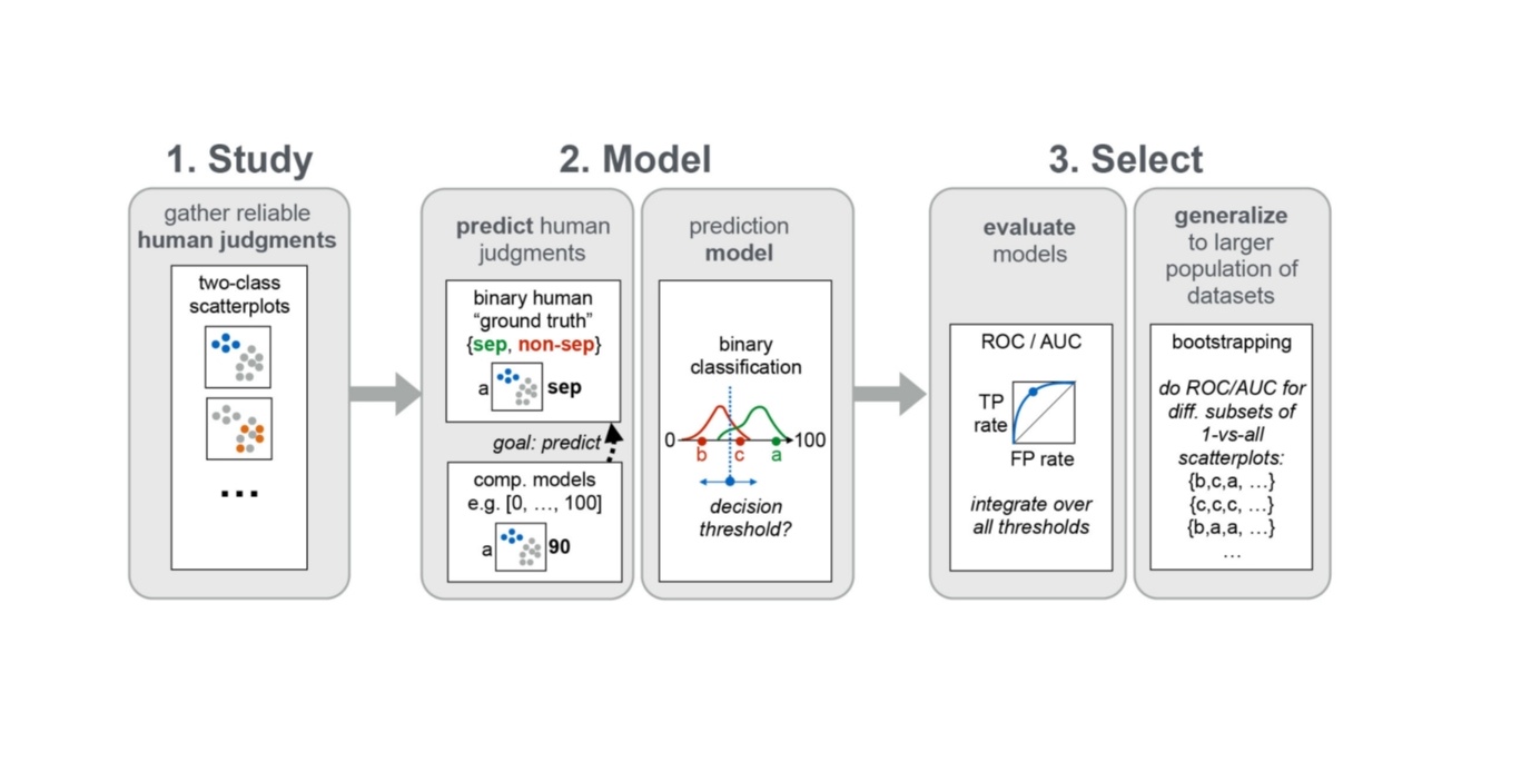
Visual quality measures seek to algorithmically imitate human judgments of patterns such as class separability, correlation, or outliers. In this paper, we propose a novel data-driven framework for evaluating such measures. The basic idea is to take a large set of visually encoded data, such as scatterplots, with reliable human "ground truth" judgements, and to use this human-labeled data to learn how well a measure would predict human judgements on previously unseen data. Measures can then be evaluated based on predictive performance-an approach that is crucial for generalizing across datasets but has gained little attention so far. To illustrate our framework, we use it to evaluate 15 state-of-the-art class separation measures, using human ground truth data from 828 class separation judgments on color-coded 2D scatterplots.BibTeX