T. Castermans, M. van Garderen, W. Meulemans, M. Nöllenburg, and X. Yuan, “Short Plane Supports for Spatial Hypergraphs,” in
Graph Drawing and Network Visualization. GD 2018. Lecture Notes in Computer Science, vol. 11282, T. Biedl and A. Kerren, Eds., in Graph Drawing and Network Visualization. GD 2018. Lecture Notes in Computer Science, vol. 11282. , Springer International Publishing, 2019, pp. 53–66. doi:
10.1007/978-3-030-04414-5_4.
Abstract
AgraphG=(V, E)isasupportof a hypergraphH=(V, S)if every hyperedge induces a connected subgraph inG. Supports are usedfor certain types of hypergraph visualizations. In this paper we considervisualizingspatialhypergraphs, where each vertex has a fixed location inthe plane. This is the case, e.g., when modeling set systems of geospatiallocations as hypergraphs. By applying established aesthetic quality cri-teria we are interested in finding supports that yield plane straight-linedrawings with minimum total edge length on the input point setV.Wefirst show, from a theoretical point of view, that the problem isNP-hardalready under rather mild conditions as well as a negative approxima-bility results. Therefore, the main focus of the paper lies on practicalheuristic algorithms as well as an exact, ILP-based approach for comput-ing short plane supports. We report results from computational exper-iments that investigate the effect of requiring planarity and acyclicityon the resulting support length. Further, we evaluate the performanceand trade-offs between solution quality and speed of several heuristicsrelative to each other and compared to optimal solutions.BibTeX
C. Schulz
et al., “A Framework for Pervasive Visual Deficiency Simulation,” in
Proceedings of the IEEE Conference on Virtual Reality and 3D User Interfaces (VR), in Proceedings of the IEEE Conference on Virtual Reality and 3D User Interfaces (VR). 2019, pp. 1852–1857. doi:
10.1109/VR44988.2019.9044164.
Abstract
We present a framework for rapid prototyping of pervasive visual deficiency simulation in the context of graphical interfaces, virtual reality, and augmented reality. Our framework facilitates the emulation of various visual deficiencies for a wide range of applications, which allows users with normal vision to experience combinations of conditions such as myopia, hyperopia, presbyopia, cataract, nyctalopia, protanopia, deuteranopia, tritanopia, and achromatopsia. Our framework provides an infrastructure to encourage researchers to evaluate visualization and other display techniques regarding visual deficiencies, and opens up the field of visual disease simulation to a broader audience. The benefits of our framework are easy integration, configuration, fast prototyping, and portability to new emerging hardware. To demonstrate the applicability of our framework, we showcase a desktop application and an Android application that transform commodity hardware into glasses for visual deficiency simulation. We expect that this work promotes a greater understanding of visual impairments, leads to better product design for the visually impaired, and forms a basis for research to compensate for these impairments as everyday helpBibTeX
M. Behrisch
et al., “Quality Metrics for Information Visualization,”
Computer Graphics Forum, vol. 37, no. 3, Art. no. 3, 2018, doi:
https://doi.org/10.1111/cgf.13446.
Abstract
The visualization community has developed to date many intuitions and understandings of how to judge the quality of views in visualizing data. The computation of a visualization's quality and usefulness ranges from measuring clutter and overlap, up to the existence and perception of specific (visual) patterns. This survey attempts to report, categorize and unify the diverse understandings and aims to establish a common vocabulary that will enable a wide audience to understand their differences and subtleties. For this purpose, we present a commonly applicable quality metric formalization that should detail and relate all constituting parts of a quality metric. We organize our corpus of reviewed research papers along the data types established in the information visualization community: multi‐ and high‐dimensional, relational, sequential, geospatial and text data. For each data type, we select the visualization subdomains in which quality metrics are an active research field and report their findings, reason on the underlying concepts, describe goals and outline the constraints and requirements. One central goal of this survey is to provide guidance on future research opportunities for the field and outline how different visualization communities could benefit from each other by applying or transferring knowledge to their respective subdomain. Additionally, we aim to motivate the visualization community to compare computed measures to the perception of humans.BibTeX
C. Schulz, A. Zeyfang, M. van Garderen, H. Ben Lahmar, M. Herschel, and D. Weiskopf, “Simultaneous Visual Analysis of Multiple Software Hierarchies,” in
Proceedings of the IEEE Working Conference on Software Visualization (VISSOFT), in Proceedings of the IEEE Working Conference on Software Visualization (VISSOFT). IEEE, 2018, pp. 87–95. doi:
10.1109/VISSOFT.2018.00017.
Abstract
We propose a tree visualization technique for comparison of structures and attributes across multiple hierarchies. Many software systems are structured hierarchically by design. For example, developers subdivide source code into libraries, modules, and functions. This design propagates to software configuration and business processes, rendering software hierarchies even more important. Often these structural elements are attributed with reference counts, code quality metrics, and the like. Throughout the entire software life cycle, these hierarchies are reviewed, integrated, debugged, and changed many times by different people so that the identity of a structural element and its attributes is not clearly traceable. We argue that pairwise comparison of similar trees is a tedious task due to the lack of overview, especially when applied to a large number of hierarchies. Therefore, we strive to visualize multiple similar trees as a whole by merging them into one supertree. To merge structures and combine attributes from different trees, we leverage the Jaccard similarity and solve a matching problem while keeping track of the origin of a structure element and its attributes. Our visualization approach allows users to inspect these supertrees using node-link diagrams and indented tree plots. The nodes in these plots depict aggregated attributes and, using word-sized line plots, detailed data. We demonstrate the usefulness of our method by exploring the evolution of software repositories and debugging data processing pipelines using provenance data.BibTeX
C. Schulz, A. Nocaj, J. Goertler, O. Deussen, U. Brandes, and D. Weiskopf, “Probabilistic Graph Layout for Uncertain Network Visualization,”
IEEE Transactions on Visualization and Computer Graphics, vol. 23, no. 1, Art. no. 1, 2017, doi:
10.1109/TVCG.2016.2598919.
Abstract
We present a novel uncertain network visualization technique based on node-link diagrams. Nodes expand spatially in our probabilistic graph layout, depending on the underlying probability distributions of edges. The visualization is created by computing a two-dimensional graph embedding that combines samples from the probabilistic graph. A Monte Carlo process is used to decompose a probabilistic graph into its possible instances and to continue with our graph layout technique. Splatting and edge bundling are used to visualize point clouds and network topology. The results provide insights into probability distributions for the entire network-not only for individual nodes and edges. We validate our approach using three data sets that represent a wide range of network types: synthetic data, protein-protein interactions from the STRING database, and travel times extracted from Google Maps. Our approach reveals general limitations of the force-directed layout and allows the user to recognize that some nodes of the graph are at a specific position just by chance.BibTeX
M. van Garderen, B. Pampel, A. Nocaj, and U. Brandes, “Minimum-Displacement Overlap Removal for Geo-referenced Data Visualization,”
Computer Graphics Forum, vol. 36, no. 3, Art. no. 3, 2017, doi:
10.1111/cgf.13199.
Abstract
Given a set of rectangles embedded in the plane, we consider the problem of adjusting the layout to remove all overlap while preserving the orthogonal order of the rectangles. The objective is to minimize the displacement of the rectangles. We call this problem Minimum-Displacement Overlap Removal (mdor). Our interest in this problem is motivated by the application of displaying metadata of archaeological sites. Because most existing overlap removal algorithms are not designed to minimize displacement while preserving orthogonal order, we present and compare several approaches which are tailored to our particular usecase. We introduce a new overlap removal heuristic which we call reArrange. Although conceptually simple, it is very effective in removing the overlap while keeping the displacement small. Furthermore, we propose an additional procedure to repair the orthogonal order after every iteration, with which we extend both our new heuristic and PRISM, a widely used overlap removal algorithm. We compare the performance of both approaches with and without this order repair method. The experimental results indicate that reArrange is very effective for heterogeneous input data where the overlap is concentrated in few dense regions.BibTeX
J. Hildenbrand, A. Nocaj, and U. Brandes, “Flexible Level-of-Detail Rendering for Large Graphs,” vol. Graph Drawing and Network Visualization. GD 2016. Lecture Notes in Computer Science, no. 9801, Y. Hu and M. Nöllenburg, Eds., 2016. doi:
10.1007/978-3-319-50106-2.
Abstract
The visualization of graphs using classical node-link diagrams works well upto the point where the number of nodes exceeds the capacity of the display.To overcome this limitation Zinsmaier et al. 5 proposed a rendering techniquewhich aggregates nodes based on their spatial distribution, thereby allowing forvisual exploration of large graphs. Since the rendering is done on the graphicsprocessing unit (GPU) this process is reasonably fast. However, the connectionbetween input graph and visual image is partially lost, which makes it harder,for instance, to process weights and labels of the input graph.
We reproduce their approach with the goal of establishing a flexible structureto improve the connection between input data and visualization. Additionally,we control the layout features in a more direct way. For example, contour linesare explicitly drawn in order to remove fuzziness of the density visualization.Though the proposed CPU-based approach cannot render at interactive rates, itcan be computed as a preprocessing step and then interactively explored givensome predefined resolution constraints.BibTeX
A. Nocaj, M. Ortmann, and U. Brandes, “Adaptive Disentanglement Based on Local Clustering in Small-World Network Visualization,”
IEEE Transactions on Visualization and Computer Graphics, vol. 22, no. 6, Art. no. 6, 2016, doi:
10.1109/TVCG.2016.2534559.
Abstract
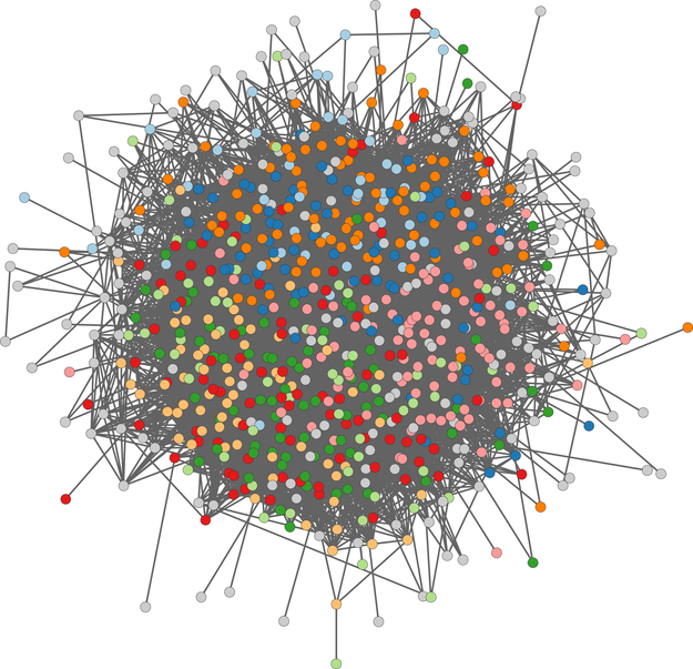
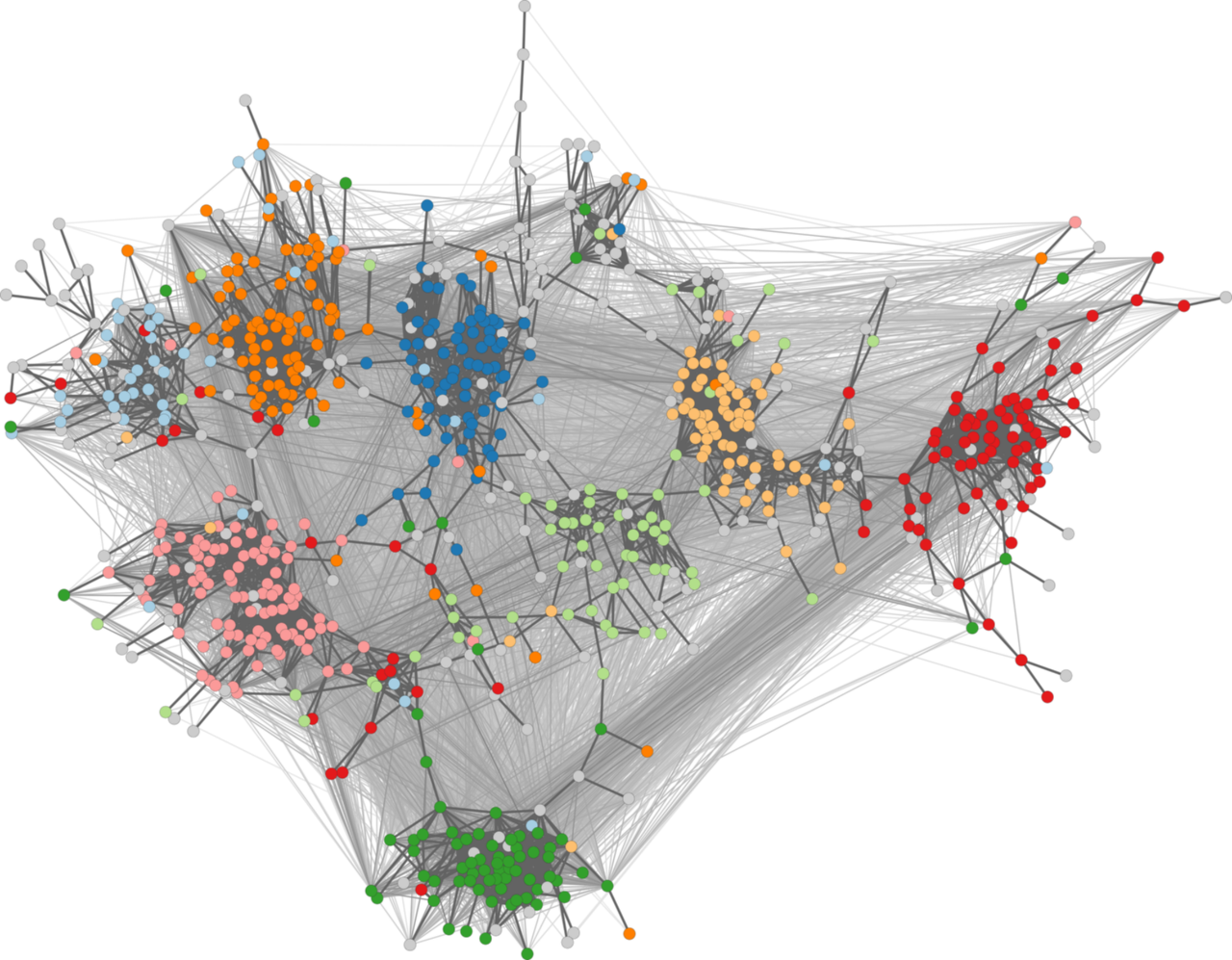
Small-world networks have characteristically low pairwise shortest-path distances, causing distance-based layout methods to generate hairball drawings. Recent approaches thus aim at finding a sparser representation of the graph to amplify variations in pairwise distances. Since the effect of sparsification on the layout is difficult to describe analytically, the incorporated filtering parameters of these approaches typically have to be selected manually and individually for each input instance. We here propose the use of graph invariants to determine suitable parameters automatically. This allows us to perform adaptive filtering to obtain drawings in which the cluster structure is most prominent. The approach is based on an empirical relationship between input and output characteristics that is derived from real and synthetic networks. Experimental evaluation shows the effectiveness of our approach and suggests that it can be used by default to increase the robustness of force-directed layout methods.BibTeX
C. Schulz
et al., “Generative Data Models for Validation and Evaluation of Visualization Techniques,” in
Proceedings of the Workshop on Beyond Time and Errors: Novel Evaluation Methods for Visualization (BELIV), in Proceedings of the Workshop on Beyond Time and Errors: Novel Evaluation Methods for Visualization (BELIV). ACM, 2016, pp. 112–124. doi:
10.1145/2993901.2993907.
Abstract
We argue that there is a need for substantially more research on the use of generative data models in the validation and evaluation of visualization techniques. For example, user studies will require the display of representative and uncon-founded visual stimuli, while algorithms will need functional coverage and assessable benchmarks. However, data is often collected in a semi-automatic fashion or entirely hand-picked, which obscures the view of generality, impairs availability, and potentially violates privacy. There are some sub-domains of visualization that use synthetic data in the sense of generative data models, whereas others work with real-world-based data sets and simulations. Depending on the visualization domain, many generative data models are "side projects" as part of an ad-hoc validation of a techniques paper and thus neither reusable nor general-purpose. We review existing work on popular data collections and generative data models in visualization to discuss the opportunities and consequences for technique validation, evaluation, and experiment design. We distill handling and future directions, and discuss how we can engineer generative data models and how visualization research could benefit from more and better use of generative data models.BibTeX