Y. Xue
et al., “Reducing Ambiguities in Line-Based Density Plots by Image-Space Colorization,”
IEEE Transactions on Visualization & Computer Graphics, vol. 30, no. 01, Art. no. 01, Jan. 2024, doi:
10.1109/TVCG.2023.3327149.
Abstract
Line-based density plots are used to reduce visual clutter in line charts with a multitude of individual lines. However, these traditional density plots are often perceived ambiguously, which obstructs the user's identification of underlying trends in complex datasets. Thus, we propose a novel image space coloring method for line-based density plots that enhances their interpretability. Our method employs color not only to visually communicate data density but also to highlight similar regions in the plot, allowing users to identify and distinguish trends easily. We achieve this by performing hierarchical clustering based on the lines passing through each region and mapping the identified clusters to the hue circle using circular MDS. Additionally, we propose a heuristic approach to assign each line to the most probable cluster, enabling users to analyze density and individual lines. We motivate our method by conducting a small-scale user study, demonstrating the effectiveness of our method using synthetic and real-world datasets, and providing an interactive online tool for generating colored line-based density plots.BibTeX
T. Krake, D. Klötzl, D. Hägele, and D. Weiskopf, “Uncertainty-Aware Seasonal-Trend Decomposition Based on Loess,”
IEEE Transactions on Visualization and Computer Graphics, pp. 1–16, 2024, doi:
10.1109/TVCG.2024.3364388.
Abstract
Seasonal-trend decomposition based on loess (STL) is a powerful tool to explore time series data visually. In this paper, we present an extension of STL to uncertain data, named uncertainty-aware STL (UASTL). Our method propagates multivariate Gaussian distributions mathematically exactly through the entire analysis and visualization pipeline. Thereby, stochastic quantities shared between the components of the decomposition are preserved. Moreover, we present application scenarios with uncertainty modeling based on Gaussian processes, e.g., data with uncertain areas or missing values. Besides these mathematical results and modeling aspects, we introduce visualization techniques that address the challenges of uncertainty visualization and the problem of visualizing highly correlated components of a decomposition. The global uncertainty propagation enables the time series visualization with STL-consistent samples, the exploration of correlation between and within decomposition's components, and the analysis of the impact of varying uncertainty. Finally, we show the usefulness of UASTL and the importance of uncertainty visualization with several examples. Thereby, a comparison with conventional STL is performed.BibTeX
S. A. Vriend, S. Vidyapu, K.-T. Chen, and D. Weiskopf, “Which Experimental Design is Better Suited for VQA Tasks? Eye Tracking Study on Cognitive Load, Performance, and Gaze Allocations,” in
Proceedings of the Symposium on Eye Tracking and Visualization (ETVIS), in Proceedings of the Symposium on Eye Tracking and Visualization (ETVIS). Jun. 2024. doi:
10.1145/3649902.3653519.
Abstract
We conducted an eye-tracking user study with 13 participants to investigate the influence of stimulus-question ordering and question modality on participants using visual question-answering (VQA) tasks. We examined cognitive load, task performance, and gaze allocations across five distinct experimental designs, aiming to identify setups that minimize the cognitive burden on participants. The collected performance and gaze data were analyzed using quantitative and qualitative methods. Our results indicate a significant impact of stimulus-question ordering on cognitive load and task performance, as well as a noteworthy effect of question modality on task performance. These findings offer insights for the experimental design of controlled user studies in visualization research.BibTeX
P. Paetzold, R. Kehlbeck, H. Strobelt, Y. Xue, S. Storandt, and O. Deussen, “RectEuler: Visualizing Intersecting Sets using Rectangles,”
Computer Graphics Forum, vol. 42, no. 3, Art. no. 3, 2023, doi:
https://doi.org/10.1111/cgf.14814.
Abstract
Abstract Euler diagrams are a popular technique to visualize set-typed data. However, creating diagrams using simple shapes remains a challenging problem for many complex, real-life datasets. To solve this, we propose RectEuler: a flexible, fully-automatic method using rectangles to create Euler-like diagrams. We use an efficient mixed-integer optimization scheme to place set labels and element representatives (e.g., text or images) in conjunction with rectangles describing the sets. By defining appropriate constraints, we adhere to well-formedness properties and aesthetic considerations. If a dataset cannot be created within a reasonable time or at all, we iteratively split the diagram into multiple components until a drawable solution is found. Redundant encoding of the set membership using dots and set lines improves the readability of the diagram. Our web tool lets users see how the layout changes throughout the optimization process and provides interactive explanations. For evaluation, we perform quantitative and qualitative analysis across different datasets and compare our method to state-of-the-art Euler diagram generation methods.BibTeX
M. Xue
et al., “Taurus: Towards a Unified Force Representation and Universal Solver for Graph Layout,”
IEEE Transactions on Visualization and Computer Graphics, vol. 29, no. 1, Art. no. 1, 2023, doi:
10.1109/TVCG.2022.3209371.
Abstract
Over the past few decades, a large number of graph layout techniques have been proposed for visualizing graphs from various domains. In this paper, we present a general framework, Taurus, for unifying popular techniques such as the spring-electrical model, stress model, and maxent-stress model. It is based on a unified force representation, which formulates most existing techniques as a combination of quotient-based forces that combine power functions of graph-theoretical and Euclidean distances. This representation enables us to compare the strengths and weaknesses of existing techniques, while facilitating the development of new methods. Based on this, we propose a new balanced stress model (BSM) that is able to layout graphs in superior quality. In addition, we introduce a universal augmented stochastic gradient descent (SGD) optimizer that efficiently finds proper solutions for all layout techniques. To demonstrate the power of our framework, we conduct a comprehensive evaluation of existing techniques on a large number of synthetic and real graphs. We release an open-source package, which facilitates easy comparison of different graph layout methods for any graph input as well as effectively creating customized graph layout techniques.BibTeX
N. Rodrigues, C. Schulz, S. Doring, D. Baumgartner, T. Krake, and D. Weiskopf, “Relaxed Dot Plots: Faithful Visualization of Samples and Their Distribution,”
IEEE Transactions on Visualization and Computer Graphics, vol. 29, no. 1, Art. no. 1, Jan. 2023, doi:
10.1109/TVCG.2022.3209429.
Abstract
We introduce relaxed dot plots as an improvement of nonlinear dot plots for unit visualization. Our plots produce more faithful data representations and reduce moire´ effects. Their contour is based on a customized kernel frequency estimation to match the shape of the distribution of underlying data values. Previous nonlinear layouts introduce column-centric nonlinear scaling of dot diameters for visualization of high-dynamic-range data with high peaks. We provide a mathematical approach to convert that column-centric scaling to our smooth envelope shape. This formalism allows us to use linear, root, and logarithmic scaling to find ideal dot sizes. Our method iteratively relaxes the dot layout for more correct and aesthetically pleasing results. To achieve this, we modified Lloyd's algorithm with additional constraints and heuristics. We evaluate the layouts of relaxed dot plots against a previously existing nonlinear variant and show that our algorithm produces less error regarding the underlying data while establishing the blue noise property that works against moire´ effects. Further, we analyze the readability of our relaxed plots in three crowd-sourced experiments. The results indicate that our proposed technique surpasses traditional dot plots.BibTeX
D. Hägele, T. Krake, and D. Weiskopf, “Uncertainty-Aware Multidimensional Scaling,”
IEEE Transactions on Visualization and Computer Graphics, vol. 29, no. 1, Art. no. 1, 2023, doi:
10.1109/TVCG.2022.3209420.
Abstract
We present an extension of multidimensional scaling (MDS) to uncertain data, facilitating uncertainty visualization of multidimensional data. Our approach uses local projection operators that map high-dimensional random vectors to low-dimensional space to formulate a generalized stress. In this way, our generic model supports arbitrary distributions and various stress types. We use our uncertainty-aware multidimensional scaling (UAMDS) concept to derive a formulation for the case of normally distributed random vectors and a squared stress. The resulting minimization problem is numerically solved via gradient descent. We complement UAMDS by additional visualization techniques that address the sensitivity and trustworthiness of dimensionality reduction under uncertainty. With several examples, we demonstrate the usefulness of our approach and the importance of uncertainty-aware techniques.BibTeX
D. Weiskopf, “Uncertainty Visualization: Concepts, Methods, and Applications in Biological Data Visualization,”
Frontiers in Bioinformatics, vol. 2, 2022, doi:
10.3389/fbinf.2022.793819.
Abstract
This paper provides an overview of uncertainty visualization in general, along with specific examples of applications in bioinformatics. Starting from a processing and interaction pipeline of visualization, components are discussed that are relevant for handling and visualizing uncertainty introduced with the original data and at later stages in the pipeline, which shows the importance of making the stages of the pipeline aware of uncertainty and allowing them to propagate uncertainty. We detail concepts and methods for visual mappings of uncertainty, distinguishing between explicit and implict representations of distributions, different ways to show summary statistics, and combined or hybrid visualizations. The basic concepts are illustrated for several examples of graph visualization under uncertainty. Finally, this review paper discusses implications for the visualization of biological data and future research directions.BibTeX
S. Dosdall, K. Angerbauer, L. Merino, M. Sedlmair, and D. Weiskopf, “Toward In-Situ Authoring of Situated Visualization with Chorded Keyboards,” in
15th International Symposium on Visual Information Communication and Interaction, VINCI 2022, Chur, Switzerland, August 16-18, 2022, M. Burch, G. Wallner, and D. Limberger, Eds., in 15th International Symposium on Visual Information Communication and Interaction, VINCI 2022, Chur, Switzerland, August 16-18, 2022. ACM, 2022, pp. 1–5. doi:
10.1145/3554944.3554970.
Abstract
Authoring situated visualizations in-situ is challenging due to the need of writing code in a mobile and highly dynamic fashion. To provide better support for that, we define requirements for text input methods that target situated visualization authoring. We identify wearable chorded keyboards as a potentially suitable method that fulfills some of these requirements. To further investigate this approach, we tailored a chorded keyboard device to visualization authoring, developed a learning application, and conducted a pilot user study. Our results confirm that learning a high number of chords is the main barrier for adoption, as in other application areas. Based on that, we discuss ideas on how chorded keyboards with a strongly reduced alphabet, hand gestures, and voice recognition might be used as a viable, multi-modal support for authoring situated visualizations in-situ.BibTeX
Y. Wang, M. Koch, M. Bâce, D. Weiskopf, and A. Bulling, “Impact of Gaze Uncertainty on AOIs in Information Visualisations,” in
2022 Symposium on Eye Tracking Research and Applications, in 2022 Symposium on Eye Tracking Research and Applications. ACM, Jun. 2022, pp. 1–6. doi:
10.1145/3517031.3531166.
Abstract
Gaze-based analysis of areas of interest (AOI) is widely used in information visualisation research to understand how people explore visualisations or assess the quality of visualisations concerning key characteristics such as memorability. However, nearby AOIs in visualisations amplify the uncertainty caused by the gaze estimation error, which strongly influences the mapping between gaze samples or fixations and different AOIs. We contribute a novel investigation into gaze uncertainty and quantify its impact on AOI-based analysis on visualisations using two novel metrics: the Flipping Candidate Rate (FCR) and Hit Any AOI Rate (HAAR). Our analysis of 40 real-world visualisations, including human gaze and AOI annotations, shows that uncertainty commonly appears in visualisations, which significantly impacts the analysis conducted in AOI-based studies. Moreover, we analysed four visualisation types and found that bar and scatter plots are commonly designed in a way that causes more uncertainty than line and pie plots in gaze-based analysis.BibTeX
F. Schreiber and D. Weiskopf, “Quantitative Visual Computing,”
it - Information Technology, vol. 64, no. 4–5, Art. no. 4–5, 2022, doi:
doi:10.1515/itit-2022-0048.
BibTeX
Y. Zhang, K. Klein, O. Deussen, T. Gutschlag, and S. Storandt, “Robust Visualization of Trajectory Data,”
it - Information Technology, vol. 64, no. 4–5, Art. no. 4–5, 2022, doi:
doi:10.1515/itit-2022-0036.
Abstract
The analysis of movement trajectories plays a central role in many application areas, such as traffic management, sports analysis, and collective behavior research, where large and complex trajectory data sets are routinely collected these days. While automated analysis methods are available to extract characteristics of trajectories such as statistics on the geometry, movement patterns, and locations that might be associated with important events, human inspection is still required to interpret the results, derive parameters for the analysis, compare trajectories and patterns, and to further interpret the impact factors that influence trajectory shapes and their underlying movement processes. Every step in the acquisition and analysis pipeline might introduce artifacts or alterate trajectory features, which might bias the human interpretation or confound the automated analysis. Thus, visualization methods as well as the visualizations themselves need to take into account the corresponding factors in order to allow sound interpretation without adding or removing important trajectory features or putting a large strain on the analyst. In this paper, we provide an overview of the challenges arising in robust trajectory visualization tasks. We then discuss several methods that contribute to improved visualizations. In particular, we present practical algorithms for simplifying trajectory sets that take semantic and uncertainty information directly into account. Furthermore, we describe a complementary approach that allows to visualize the uncertainty along with the trajectories.BibTeX
J. Görtler
et al., “Neo: Generalizing Confusion Matrix Visualization to Hierarchical and Multi-Output Labels,” in
Proceedings of the 2022 CHI Conference on Human Factors in Computing Systems, in Proceedings of the 2022 CHI Conference on Human Factors in Computing Systems. New Orleans, LA, USA: Association for Computing Machinery, 2022, pp. 1–13. doi:
10.1145/3491102.3501823.
Abstract
The confusion matrix, a ubiquitous visualization for helping people evaluate machine learning models, is a tabular layout that compares predicted class labels against actual class labels over all data instances. We conduct formative research with machine learning practitioners at Apple and find that conventional confusion matrices do not support more complex data-structures found in modern-day applications, such as hierarchical and multi-output labels. To express such variations of confusion matrices, we design an algebra that models confusion matrices as probability distributions. Based on this algebra, we develop Neo, a visual analytics system that enables practitioners to flexibly author and interact with hierarchical and multi-output confusion matrices, visualize derived metrics, renormalize confusions, and share matrix specifications. Finally, we demonstrate Neo’s utility with three model evaluation scenarios that help people better understand model performance and reveal hidden confusions.BibTeX
R. Kehlbeck, J. Görtler, Y. Wang, and O. Deussen, “SPEULER: Semantics-preserving Euler Diagrams,”
IEEE Transactions on Visualization and Computer Graphics, vol. 28, no. 1, Art. no. 1, 2022, doi:
10.1109/TVCG.2021.3114834.
Abstract
Creating comprehensible visualizations of highly overlapping set-typed data is a challenging task due to its complexity. To facilitate insights into set connectivity and to leverage semantic relations between intersections, we propose a fast two-step layout technique for Euler diagrams that are both well-matched and well-formed. Our method conforms to established form guidelines for Euler diagrams regarding semantics, aesthetics, and readability. First, we establish an initial ordering of the data, which we then use to incrementally create a planar, connected, and monotone dual graph representation. In the next step, the graph is transformed into a circular layout that maintains the semantics and yields simple Euler diagrams with smooth curves. When the data cannot be represented by simple diagrams, our algorithm always falls back to a solution that is not well-formed but still well-matched, whereas previous methods often fail to produce expected results. We show the usefulness of our method for visualizing set-typed data using examples from text analysis and infographics. Furthermore, we discuss the characteristics of our approach and evaluate our method against state-of-the-art methods.BibTeX
D. Hägele
et al., “Uncertainty Visualization: Fundamentals and Recent Developments,”
it - Information Technology, vol. 64, no. 4–5, Art. no. 4–5, 2022, doi:
10.1515/itit-2022-0033.
Abstract
This paper provides a brief overview of uncertainty visualization along with some fundamental considerations on uncertainty propagation and modeling. Starting from the visualization pipeline, we discuss how the different stages along this pipeline can be affected by uncertainty and how they can deal with this and propagate uncertainty information to subsequent processing steps. We illustrate recent advances in the field with a number of examples from a wide range of applications: uncertainty visualization of hierarchical data, multivariate time series, stochastic partial differential equations, and data from linguistic annotation.BibTeX
C. Schulz
et al., “Multi-Class Inverted Stippling,”
ACM Trans. Graph., vol. 40, no. 6, Art. no. 6, Dec. 2021, doi:
10.1145/3478513.3480534.
Abstract
We introduce inverted stippling, a method to mimic an inversion technique used by artists when performing stippling. To this end, we extend Linde-Buzo-Gray (LBG) stippling to multi-class LBG (MLBG) stippling with multiple layers. MLBG stippling couples the layers stochastically to optimize for per-layer and overall blue-noise properties. We propose a stipple-based filling method to generate solid color backgrounds for inverting areas. Our experiments demonstrate the effectiveness of MLBG in terms of reducing overlapping and intensity accuracy. In addition, we showcase MLBG with color stippling and dynamic multi-class blue-noise sampling, which is possible due to its support for temporal coherence.BibTeX
K. Gadhave
et al., “Predicting intent behind selections in scatterplot visualizations,”
Information Visualization, vol. 20, no. 4, Art. no. 4, 2021, doi:
10.1177/14738716211038604.
Abstract
Predicting and capturing an analyst’s intent behind a selection in a data visualization is valuable in two scenarios: First, a successful prediction of a pattern an analyst intended to select can be used to auto-complete a partial selection which, in turn, can improve the correctness of the selection. Second, knowing the intent behind a selection can be used to improve recall and reproducibility. In this paper, we introduce methods to infer analyst’s intents behind selections in data visualizations, such as scatterplots. We describe intents based on patterns in the data, and identify algorithms that can capture these patterns. Upon an interactive selection, we compare the selected items with the results of a large set of computed patterns, and use various ranking approaches to identify the best pattern for an analyst’s selection. We store annotations and the metadata to reconstruct a selection, such as the type of algorithm and its parameterization, in a provenance graph. We present a prototype system that implements these methods for tabular data and scatterplots. Analysts can select a prediction to auto-complete partial selections and to seamlessly log their intents. We discuss implications of our approach for reproducibility and reuse of analysis workflows. We evaluate our approach in a crowd-sourced study, where we show that auto-completing selection improves accuracy, and that we can accurately capture pattern-based intent.BibTeX
T. Müller, C. Schulz, and D. Weiskopf, “Adaptive Polygon Rendering for Interactive Visualization in the Schwarzschild Spacetime,”
European Journal of Physics, vol. 43, no. 1, Art. no. 1, 2021, doi:
10.1088/1361-6404/ac2b36.
Abstract
Interactive visualization is a valuable tool for introductory or advanced courses in general relativity as well as for public outreach to provide a deeper understanding of the visual implications due to curved spacetime. In particular, the extreme case of a black hole where the curvature becomes so strong that even light cannot escape, benefits from an interactive visualization where students can investigate the distortion effects by moving objects around. However, the most commonly used technique of four-dimensional general-relativistic ray tracing is still too slow for interactive frame rates. Therefore, we propose an efficient and adaptive polygon rendering method that takes light deflection and light travel time into account. An additional advantage of this method is that it provides a natural demonstration of how multiple images occur and how light travel time affects them. Finally, we present our method using three example scenes: a triangle passing behind a black hole, a sphere orbiting a black hole and an accretion disk with different inclination angles.BibTeX
K. Schatz
et al., “2019 IEEE Scientific Visualization Contest Winner: Visual Analysis of Structure Formation in Cosmic Evolution,”
IEEE Computer Graphics and Applications, vol. 41, no. 6, Art. no. 6, 2021, doi:
10.1109/MCG.2020.3004613.
Abstract
Simulations of cosmic evolution are a means to explain the formation of the universe as we see it today. The resulting data of such simulations comprise numerous physical quantities, which turns their analysis into a complex task. Here, we analyze such high-dimensional and time-varying particle data using various visualization techniques from the fields of particle visualization, flow visualization, volume visualization, and information visualization. Our approach employs specialized filters to extract and highlight the development of so-called active galactic nuclei and filament structures formed by the particles. Additionally, we calculate X-ray emission of the evolving structures in a preprocessing step to complement visual analysis. Our approach is integrated into a single visual analytics framework to allow for analysis of star formation at interactive frame rates. Finally, we lay out the methodological aspects of our work that led to success at the 2019 IEEE SciVis Contest.BibTeX
N. Brich
et al., “Visual Analysis of Multivariate Intensive Care Surveillance Data,” in
Eurographics Workshop on Visual Computing for Biology and Medicine, B. Kozlíková, M. Krone, N. Smit, K. Nieselt, and R. G. Raidou, Eds., in Eurographics Workshop on Visual Computing for Biology and Medicine. The Eurographics Association, 2020. doi:
10.2312/vcbm.20201174.
Abstract
We present an approach for visual analysis of high-dimensional measurement data with varying sampling rates in the context of an experimental post-surgery study performed on a porcine surrogate model. The study aimed at identifying parameters suitable for diagnosing and prognosticating the volume state-a crucial and difficult task in intensive care medicine. In intensive care, most assessments not only depend on a single measurement but a plethora of mixed measurements over time. Even for trained experts, efficient and accurate analysis of such multivariate time-dependent data remains a challenging task. We present a linked-view post hoc visual analysis application that reduces data complexity by combining projection-based time curves for overview with small multiples for details on demand. Our approach supports not only the analysis of individual patients but also the analysis of ensembles by adapting existing techniques using non-parametric statistics. We evaluated the effectiveness and acceptance of our application through expert feedback with domain scientists from the surgical department using real-world data: the results show that our approach allows for detailed analysis of changes in patient state while also summarizing the temporal development of the overall condition. Furthermore, the medical experts believe that our method can be transferred from medical research to the clinical context, for example, to identify the early onset of a sepsis.BibTeX
P. Balestrucci
et al., “Pipelines Bent, Pipelines Broken: Interdisciplinary Self-Reflection on the Impact of COVID-19 on Current and Future Research (Position Paper),” in
2020 IEEE Workshop on Evaluation and Beyond-Methodological Approaches to Visualization (BELIV), in 2020 IEEE Workshop on Evaluation and Beyond-Methodological Approaches to Visualization (BELIV). IEEE, 2020, pp. 11--18. doi:
10.1109/BELIV51497.2020.00009.
Abstract
Among the many changes brought about by the COVID-19 pandemic, one of the most pressing for scientific research concerns user testing. For the researchers who conduct studies with human participants, the requirements for social distancing have created a need for reflecting on methodologies that previously seemed relatively straightforward. It has become clear from the emerging literature on the topic and from first-hand experiences of researchers that the restrictions due to the pandemic affect every aspect of the research pipeline. The current paper offers an initial reflection on user-based research, drawing on the authors' own experiences and on the results of a survey that was conducted among researchers in different disciplines, primarily psychology, human-computer interaction (HCI), and visualization communities. While this sampling of researchers is by no means comprehensive, the multi-disciplinary approach and the consideration of different aspects of the research pipeline allow us to examine current and future challenges for user-based research. Through an exploration of these issues, this paper also invites others in the VIS-as well as in the wider-research community, to reflect on and discuss the ways in which the current crisis might also present new and previously unexplored opportunities.BibTeX
N. Rodrigues, C. Schulz, A. Lhuillier, and D. Weiskopf, “Cluster-Flow Parallel Coordinates: Tracing Clusters Across Subspaces,” in
Proceedings of Graphics Interface 2020, in Proceedings of Graphics Interface 2020. Canadian Human-Computer Communications Society / Société canadienne du dialogue humain-machine, 2020, pp. 382–392. doi:
10.20380/GI2020.38.
Abstract
We present a novel variant of parallel coordinates plots (PCPs) in which we show clusters in 2D subspaces of multivariate data and emphasize flow between them. We achieve this by duplicating and stacking individual axes vertically. On a high level, our clusterflow layout shows how data points move from one cluster to another in different subspaces. We achieve cluster-based bundling and limit plot growth through the reduction of available vertical space for each duplicated axis. Although we introduce space between clusters, we preserve the readability of intra-cluster correlations by starting and ending with the original slopes from regular PCPs and drawing Hermite spline segments in between. Moreover, our rendering technique enables the visualization of small and large data sets alike. Cluster-flow PCPs can even propagate the uncertainty inherent to fuzzy clustering through the layout and rendering stages of our pipeline. Our layout algorithm is based on A*. It achieves an optimal result with regard to a novel set of cost functions that allow us to arrange axes horizontally (dimension ordering) and vertically (cluster ordering).BibTeX
M. Sondag, W. Meulemans, C. Schulz, K. Verbeek, D. Weiskopf, and B. Speckmann, “Uncertainty Treemaps,” in
Proceedings of the IEEE Pacific Visualization Symposium (PacificVis), in Proceedings of the IEEE Pacific Visualization Symposium (PacificVis). 2020, pp. 111–120. doi:
10.1109/PacificVis48177.2020.7614.
Abstract
Rectangular treemaps visualize hierarchical numerical data by recursively partitioning an input rectangle into smaller rectangles whose areas match the data. Numerical data often has uncertainty associated with it. To visualize uncertainty in a rectangular treemap, we identify two conflicting key requirements: (i) to assess the data value of a node in the hierarchy, the area of its rectangle should directly match its data value, and (ii) to facilitate comparison between data and uncertainty, uncertainty should be encoded using the same visual variable as the data, that is, area. We present Uncertainty Treemaps, which meet both requirements simultaneously by introducing the concept of hierarchical uncertainty masks. First, we define a new cost function that measures the quality of Uncertainty Treemaps. Then, we show how to adapt existing treemapping algorithms to support uncertainty masks. Finally, we demonstrate the usefulness and quality of our technique through an expert review and a computational experiment on real-world datasets.BibTeX
Y. Wang, Z. Wang, C.-W. Fu, H. Schmauder, O. Deussen, and D. Weiskopf, “Image-Based Aspect Ratio Selection.,”
IEEE Transactions on Visualization and Computer Graphics, vol. 25, no. 1, Art. no. 1, 2019, doi:
10.1109/TVCG.2018.2865266.
Abstract
Selecting a good aspect ratio is crucial for effective 2D diagrams. There are several aspect ratio selection methods for function plots and line charts, but only few can handle general, discrete diagrams such as 2D scatter plots. However, these methods either lack a perceptual foundation or heavily rely on intermediate isoline representations, which depend on choosing the right isovalues and are time-consuming to compute. This paper introduces a general image-based approach for selecting aspect ratios for a wide variety of 2D diagrams, ranging from scatter plots and density function plots to line charts. Our approach is derived from Federer's co-area formula and a line integral representation that enable us to directly construct image-based versions of existing selection methods using density fields. In contrast to previous methods, our approach bypasses isoline computation, so it is faster to compute, while following the perceptual foundation to select aspect ratios. Furthermore, this approach is complemented by an anisotropic kernel density estimation to construct density fields, allowing us to more faithfully characterize data patterns, such as the subgroups in scatterplots or dense regions in time series. We demonstrate the effectiveness of our approach by quantitatively comparing to previous methods and revisiting a prior user study. Finally, we present extensions for ROI banking, multi-scale banking, and the application to image data.BibTeX
J. Görtler, M. Spicker, C. Schulz, D. Weiskopf, and O. Deussen, “Stippling of 2D Scalar Fields,”
IEEE Transactions on Visualization and Computer Graphics, vol. 25, no. 6, Art. no. 6, 2019, doi:
10.1109/TVCG.2019.2903945.
Abstract
We propose a technique to represent two-dimensional data using stipples. While stippling is often regarded as an illustrative method, we argue that it is worth investigating its suitability for the visualization domain. For this purpose, we generalize the Linde-Buzo-Gray stippling algorithm for information visualization purposes to encode continuous and discrete 2D data. Our proposed modifications provide more control over the resulting distribution of stipples for encoding additional information into the representation, such as contours. We show different approaches to depict contours in stipple drawings based on locally adjusting the stipple distribution. Combining stipple-based gradients and contours allows for simultaneous assessment of the overall structure of the data while preserving important local details. We discuss the applicability of our technique using datasets from different domains and conduct observation-validating studies to assess the perception of stippled representationsBibTeX
K. Schatz
et al., “Visual Analysis of Structure Formation in Cosmic Evolution,” in
Proceedings of the IEEE Scientific Visualization Conference (SciVis), in Proceedings of the IEEE Scientific Visualization Conference (SciVis). 2019, pp. 33–41. doi:
10.1109/scivis47405.2019.8968855.
Abstract
The IEEE SciVis 2019 Contest targets the visual analysis of structure formation in the cosmic evolution of the universe from when the universe was five million years old up to now. In our submission, we analyze high-dimensional data to get an overview, then investigate the impact of Active Galactic Nuclei (AGNs) using various visualization techniques, for instance, an adapted filament filtering method for detailed analysis and particle flow in the vicinity of filaments. Based on feedback from domain scientists on these initial visualizations, we also analyzed X-ray emissions and star formation areas. The conversion of star-forming gas to stars and the resulting increasing molecular weight of the particles could be observed.BibTeX
V. Bruder, C. Schulz, R. Bauer, S. Frey, D. Weiskopf, and T. Ertl, “Voronoi-Based Foveated Volume Rendering,” in
Proceedings of the Eurographics Conference on Visualization - Short Papers (EuroVis), J. Johansson, F. Sadlo, and G. E. Marai, Eds., in Proceedings of the Eurographics Conference on Visualization - Short Papers (EuroVis). Eurographics Association, 2019, pp. 67–71. doi:
10.2312/evs.20191172.
Abstract
Foveal vision is located in the center of the field of view with a rich impression of detail and color, whereas peripheral visionoccurs on the side with more fuzzy and colorless perception. This visual acuity fall-off can be used to achieve higher frame ratesby adapting rendering quality to the human visual system. Volume raycasting has unique characteristics, preventing a directtransfer of many traditional foveated rendering techniques. We present an approach that utilizes the visual acuity fall-off toaccelerate volume rendering based on Linde-Buzo-Gray sampling and natural neighbor interpolation. First, we measure gazeusing a stationary 1200 Hz eye-tracking system. Then, we adapt our sampling and reconstruction strategy to that gaze. Finally,we apply a temporal smoothing filter to attenuate undersampling artifacts since peripheral vision is particularly sensitive tocontrast changes and movement. Our approach substantially improves rendering performance with barely perceptible changes invisual quality. We demonstrate the usefulness of our approach through performance measurements on various data seBibTeX
C. Schulz
et al., “A Framework for Pervasive Visual Deficiency Simulation,” in
Proceedings of the IEEE Conference on Virtual Reality and 3D User Interfaces (VR), in Proceedings of the IEEE Conference on Virtual Reality and 3D User Interfaces (VR). 2019, pp. 1852–1857. doi:
10.1109/VR44988.2019.9044164.
Abstract
We present a framework for rapid prototyping of pervasive visual deficiency simulation in the context of graphical interfaces, virtual reality, and augmented reality. Our framework facilitates the emulation of various visual deficiencies for a wide range of applications, which allows users with normal vision to experience combinations of conditions such as myopia, hyperopia, presbyopia, cataract, nyctalopia, protanopia, deuteranopia, tritanopia, and achromatopsia. Our framework provides an infrastructure to encourage researchers to evaluate visualization and other display techniques regarding visual deficiencies, and opens up the field of visual disease simulation to a broader audience. The benefits of our framework are easy integration, configuration, fast prototyping, and portability to new emerging hardware. To demonstrate the applicability of our framework, we showcase a desktop application and an Android application that transform commodity hardware into glasses for visual deficiency simulation. We expect that this work promotes a greater understanding of visual impairments, leads to better product design for the visually impaired, and forms a basis for research to compensate for these impairments as everyday helpBibTeX
C. Schulz, K. Schatz, M. Krone, M. Braun, T. Ertl, and D. Weiskopf, “Uncertainty Visualization for Secondary Structures of Proteins,” in
Proceedings of the IEEE Pacific Visualization Symposium (PacificVis), in Proceedings of the IEEE Pacific Visualization Symposium (PacificVis). IEEE, 2018, pp. 96–105. doi:
10.1109/PacificVis.2018.00020.
Abstract
We present a technique that conveys the uncertainty in the secondary structure of proteins-an abstraction model based on atomic coordinates. While protein data inherently contains uncertainty due to the acquisition method or the simulation algorithm, we argue that it is also worth investigating uncertainty induced by analysis algorithms that precede visualization. Our technique helps researchers investigate differences between multiple secondary structure assignment methods. We modify established algorithms for fuzzy classification and introduce a discrepancy-based approach to project an ensemble of sequences to a single importance-weighted sequence. In 2D, we depict the aggregated secondary structure assignments based on the per-residue deviation in a collapsible sequence diagram. In 3D, we extend the ribbon diagram using visual variables such as transparency, wave form, frequency, or amplitude to facilitate qualitative analysis of uncertainty. We evaluated the effectiveness and acceptance of our technique through expert reviews using two example applications: the combined assignment against established algorithms and time-dependent structural changes originating from simulated protein dynamics.BibTeX
T. Spinner, J. Körner, J. Görtler, and O. Deussen, “Towards an Interpretable Latent Space: An Intuitive Comparison of Autoencoders with Variational Autoencoders,” in
Proceedings of the Workshop on Visualization for AI Explainability (VISxAI), in Proceedings of the Workshop on Visualization for AI Explainability (VISxAI). IEEE VIS, 2018. [Online]. Available:
https://thilospinner.com/towards-an-interpretable-latent-space/Abstract
We present a comparison between autoencoders and variational autoencoders. For this, we describe their architecture and explain the respective advantages. To gain a deeper insight into the encoding and decoding process, we visualize the distribution of values in latent space for both models. While autoencoders are commonly used for compression, variational autoencoders typically act as generative models. We provide an interactive visualization to explore their differences. By manually modifying the latent activations, the user can directly observe the impact of different latent values on the generated output. In addition, we provide an information theoretic view on the compressive properties of autoencoders.BibTeX
J. Görtler, C. Schulz, O. Deussen, and D. Weiskopf, “Bubble Treemaps for Uncertainty Visualization,”
IEEE Transactions on Visualization and Computer Graphics, vol. 24, no. 1, Art. no. 1, 2018, doi:
10.1109/TVCG.2017.2743959.
Abstract
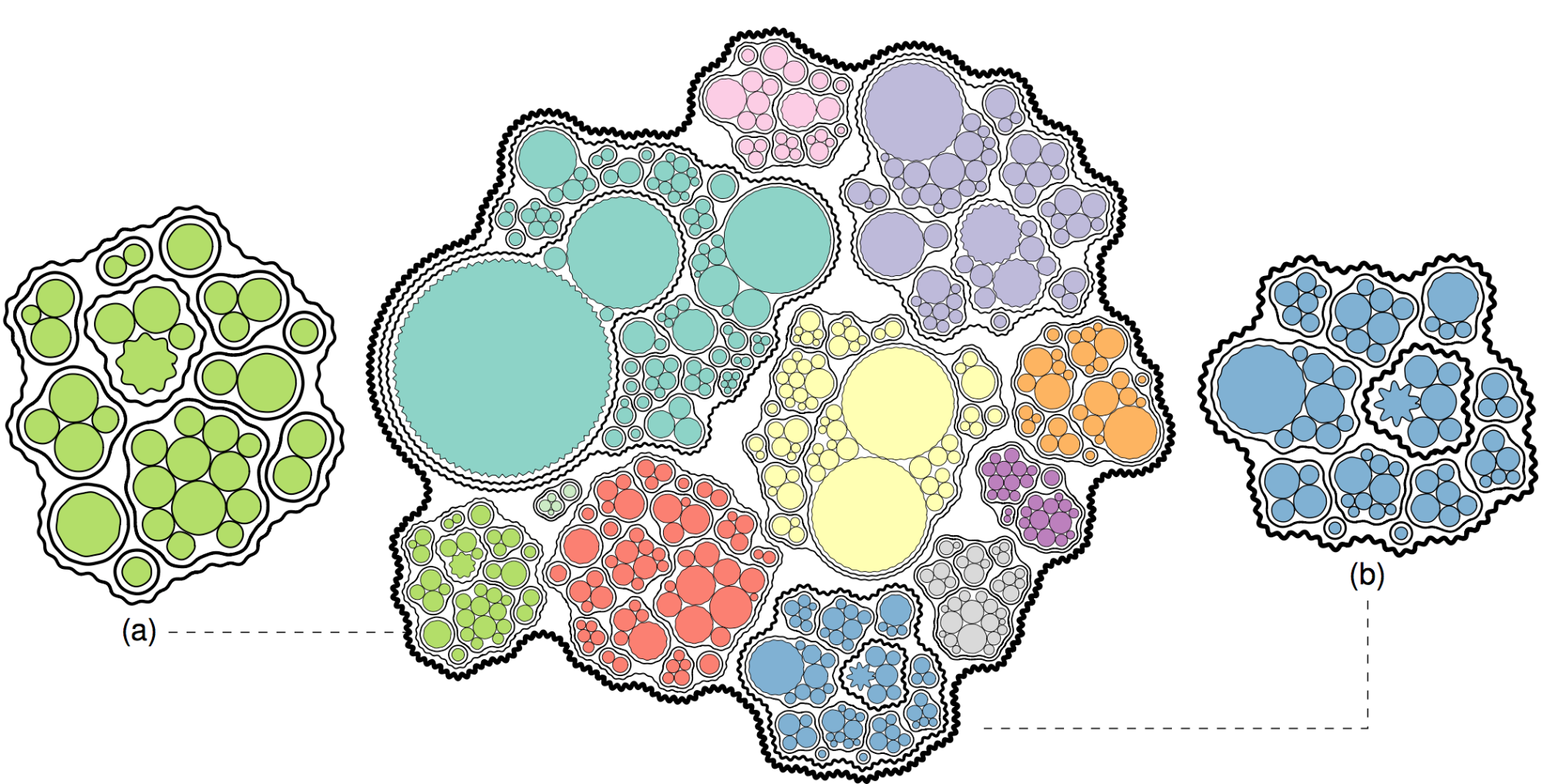
We present a novel type of circular treemap, where we intentionally allocate extra space for additional visual variables. With this extended visual design space, we encode hierarchically structured data along with their uncertainties in a combined diagram. We introduce a hierarchical and force-based circle-packing algorithm to compute Bubble Treemaps, where each node is visualized using nested contour arcs. Bubble Treemaps do not require any color or shading, which offers additional design choices. We explore uncertainty visualization as an application of our treemaps using standard error and Monte Carlo-based statistical models. To this end, we discuss how uncertainty propagates within hierarchies. Furthermore, we show the effectiveness of our visualization using three different examples: the package structure of Flare, the S&P 500 index, and the US consumer expenditure surveyBibTeX
J. Görtler, R. Kehlbeck, and O. Deussen, “A Visual Exploration of Gaussian Processes,” in
Proceedings of the Workshop on Visualization for AI Explainability (VISxAI), in Proceedings of the Workshop on Visualization for AI Explainability (VISxAI). 2018. doi:
10.23915/distill.00017.
Abstract
Even if you have spent some time reading about machine learning, chances are that you have never heard of Gaussian processes. And if you have, rehearsing the basics is always a good way to refresh your memory. With this blog post we want to give an introduction to Gaussian processes and make the mathematical intuition behind them more approachable.
Gaussian processes are a powerful tool in the machine learning toolbox. They allow us to make predictions about our data by incorporating prior knowledge. Their most obvious area of application is fitting a function to the data. This is called regression and is used, for example, in robotics or time series forecasting. But Gaussian processes are not limited to regression — they can also be extended to classification and clustering tasks. For a given set of training points, there are potentially infinitely many functions that fit the data. Gaussian processes offer an elegant solution to this problem by assigning a probability to each of these functions. The mean of this probability distribution then represents the most probable characterization of the data. Furthermore, using a probabilistic approach allows us to incorporate the confidence of the prediction into the regression result.
We will first explore the mathematical foundation that Gaussian processes are built on — we invite you to follow along using the interactive figures and hands-on examples. They help to explain the impact of individual components, and show the flexibility of Gaussian processes. After following this article we hope that you will have a visual intuition on how Gaussian processes work and how you can configure them for different types of data.BibTeX
C. Schulz, A. Zeyfang, M. van Garderen, H. Ben Lahmar, M. Herschel, and D. Weiskopf, “Simultaneous Visual Analysis of Multiple Software Hierarchies,” in
Proceedings of the IEEE Working Conference on Software Visualization (VISSOFT), in Proceedings of the IEEE Working Conference on Software Visualization (VISSOFT). IEEE, 2018, pp. 87–95. doi:
10.1109/VISSOFT.2018.00017.
Abstract
We propose a tree visualization technique for comparison of structures and attributes across multiple hierarchies. Many software systems are structured hierarchically by design. For example, developers subdivide source code into libraries, modules, and functions. This design propagates to software configuration and business processes, rendering software hierarchies even more important. Often these structural elements are attributed with reference counts, code quality metrics, and the like. Throughout the entire software life cycle, these hierarchies are reviewed, integrated, debugged, and changed many times by different people so that the identity of a structural element and its attributes is not clearly traceable. We argue that pairwise comparison of similar trees is a tedious task due to the lack of overview, especially when applied to a large number of hierarchies. Therefore, we strive to visualize multiple similar trees as a whole by merging them into one supertree. To merge structures and combine attributes from different trees, we leverage the Jaccard similarity and solve a matching problem while keeping track of the origin of a structure element and its attributes. Our visualization approach allows users to inspect these supertrees using node-link diagrams and indented tree plots. The nodes in these plots depict aggregated attributes and, using word-sized line plots, detailed data. We demonstrate the usefulness of our method by exploring the evolution of software repositories and debugging data processing pipelines using provenance data.BibTeX
P. Gralka, C. Schulz, G. Reina, D. Weiskopf, and T. Ertl, “Visual Exploration of Memory Traces and Call Stacks,” in
Proceedings of the IEEE Working Conference on Software Visualization (VISSOFT), in Proceedings of the IEEE Working Conference on Software Visualization (VISSOFT). IEEE, 2017, pp. 54–63. doi:
10.1109/VISSOFT.2017.15.
Abstract
Analysis of software performance typically takes into account clock cycles and memory consumption at each sampling point in time. Although this is a valid strategy, we argue that it is also worth investigating data and control flow structures, as observed using memory traces and call stacks, because of their importance for performance engineering. In this work, we present a visual approach to memory profiling that supports analysis of memory layout, access patterns, and aliasing in correlation to program execution. Our method leverages language-agnostic dynamic code instrumentation to minimize the impact of tracing on performance, i.e., the application remains usable on commodity hardware. The profiled data is then clustered and visualized using a density-based scatter plot. If debug symbols are available, the scatter plot is augmented by a flame graph to ease linking to the high-level source code. Our visualization helps software engineers to identify runtime behavior by relating memory addresses to instruction execution. We demonstrate our approach using a set of examples revealing different memory access patterns and discuss their influence on software performance.BibTeX
C. Schulz, A. Nocaj, J. Goertler, O. Deussen, U. Brandes, and D. Weiskopf, “Probabilistic Graph Layout for Uncertain Network Visualization,”
IEEE Transactions on Visualization and Computer Graphics, vol. 23, no. 1, Art. no. 1, 2017, doi:
10.1109/TVCG.2016.2598919.
Abstract
We present a novel uncertain network visualization technique based on node-link diagrams. Nodes expand spatially in our probabilistic graph layout, depending on the underlying probability distributions of edges. The visualization is created by computing a two-dimensional graph embedding that combines samples from the probabilistic graph. A Monte Carlo process is used to decompose a probabilistic graph into its possible instances and to continue with our graph layout technique. Splatting and edge bundling are used to visualize point clouds and network topology. The results provide insights into probability distributions for the entire network-not only for individual nodes and edges. We validate our approach using three data sets that represent a wide range of network types: synthetic data, protein-protein interactions from the STRING database, and travel times extracted from Google Maps. Our approach reveals general limitations of the force-directed layout and allows the user to recognize that some nodes of the graph are at a specific position just by chance.BibTeX
C. Schulz, M. Burch, F. Beck, and D. Weiskopf, “Visual Data Cleansing of Low-Level Eye Tracking Data,” in
Eye Tracking and Visualization: Foundations, Techniques, and Applications. ETVIS 2015, M. Burch, L. Chuang, B. Fisher, A. Schmidt, and D. Weiskopf, Eds., in Eye Tracking and Visualization: Foundations, Techniques, and Applications. ETVIS 2015. , Springer International Publishing, 2017, pp. 199–216. doi:
10.1007/978-3-319-47024-5_12.
Abstract
Analysis and visualization of eye movement data from eye-tracking studies typically take into account gazes, fixations, and saccades of both eyes filtered and fused into a combined eye. Although this is a valid strategy, we argue that it is also worth investigating low-level eye-tracking data prior to high-level analysis, because today’s eye-tracking systems measure and infer data from both eyes separately. In this work, we present an approach that supports visual analysis and cleansing of low-level time-varying data for eye-tracking experiments. The visualization helps researchers get insights into the quality of the data in terms of its uncertainty, or reliability. We discuss uncertainty originating from eye tracking, and how to reveal it for visualization, using a comparative approach for disagreement between plots, and a density-based approach for accuracy in volume rendering. Finally, we illustrate the usefulness of our approach by applying it to eye movement data recorded with two state-of-the-art eye trackers.BibTeX
C. Schulz, N. Rodrigues, K. Damarla, A. Henicke, and D. Weiskopf, “Visual Exploration of Mainframe Workloads,” in
Proceedings of the SIGGRAPH Asia Symposium on Visualization, in Proceedings of the SIGGRAPH Asia Symposium on Visualization. ACM, 2017, pp. 4:1-4:7. [Online]. Available:
http://dx.doi.org/10.1145/3139295.3139312Abstract
We present a visual analytics approach to support the workload management process for z/OS mainframes at IBM. This process typically requires the analysis of records consisting of 100 to 150 performance-related metrics, sampled over time. We aim at replacing the previous spreadsheet-based workflow with an easier, faster, and more scalable one regarding measurement periods and collected performance metrics. To achieve this goal, we collaborate with a developer embedded at IBM in a formative process. Based on that experience, we discuss the application background and formulate requirements to support decision making based on performance data for large-scale systems. Our visual approach helps analysts find outliers, patterns, and relations between performance metrics by data exploration through various visualizations. We demonstrate the usefulness and applicability of line plots, scatter plots, scatter plot matrices, parallel coordinates, and correlation matrices for workload management. Finally, we evaluate our approach in a qualitative user study with IBM domain experts.BibTeX
K. Srulijes et al., “Visualization of Eye-Head Coordination While Walking in Healthy Subjects and Patients with Neurodegenerative Diseases,” Poster (reviewed) presented on Symposium of the International Society of Posture and Gait Research (ISPGR), 2017.
BibTeX
D. Weiskopf, M. Burch, L. L. Chuang, B. Fischer, and A. Schmidt,
Eye Tracking and Visualization: Foundations, Techniques, and Applications. Berlin, Heidelberg: Springer, 2016. doi:
10.1007/978-3-319-47024-5_7.
Abstract
This book discusses research, methods, and recent developments in the interdisciplinary field that spans research in visualization, eye tracking, human-computer interaction, and psychology. It presents extended versions of papers from the First Workshop on Eye Tracking and Visualization (ETVIS), which was organized as a workshop of the IEEE VIS Conference 2015. Topics include visualization and visual analytics of eye-tracking data, metrics and cognitive models, eye-tracking experiments in the context of visualization interfaces, and eye tracking in 3D and immersive environments. The extended ETVIS papers are complemented by a chapter offering an overview of visualization approaches for analyzing eye-tracking data and a chapter that discusses electrooculography (EOG) as an alternative of acquiring information about eye movements. Covering scientific visualization, information visualization, and visual analytics, this book is a valuable resource for eye-tracking researchers within the visualization community.BibTeX
K. Kurzhals, B. Fisher, M. Burch, and D. Weiskopf, “Eye Tracking Evaluation of Visual Analytics,”
Information Visualization, vol. 15, no. 4, Art. no. 4, 2016, doi:
10.1177/1473871615609787.
Abstract
The application of eye tracking for the evaluation of humans’ viewing behavior is a common approach in psy-chological research. So far, the use of this technique for the evaluation of visual analytics and visualization isless prominent. We investigate recent scientific publications from the main visualization and visual analyticsconferences and journals, as well as related research fields that include an evaluation by eye tracking.Furthermore, we provide an overview of evaluation goals that can be achieved by eye tracking and state-of-the-art analysis techniques for eye tracking data. Ideally, visual analytics leads to a mixed-initiative cognitivesystem where the mechanism of distribution is the interaction of the user with the visualization environment.Therefore, we also include a discussion of cognitive approaches and models to include the user in the evalua-tion process. Based on our review of the current use of eye tracking evaluation in our field and the cognitivetheory, we propose directions for future research on evaluation methodology, leading to the grand challengeof developing an evaluation approach to the mixed-initiative cognitive system of visual analytics.BibTeX
K. Kurzhals, M. Hlawatsch, M. Burch, and D. Weiskopf, “Fixation-Image Charts,” in
Proceedings of the Symposium on Eye Tracking Research & Applications (ETRA), ACM, Ed., in Proceedings of the Symposium on Eye Tracking Research & Applications (ETRA), vol. 1. ACM, 2016, pp. 11–18. [Online]. Available:
http://dx.doi.org/10.1145/2857491.2857507Abstract
We facilitate the comparative visual analysis of eye tracking data from multiple participants with a visualization that represents the temporal changes of viewing behavior. Common approaches to visually analyze eye tracking data either occlude or ignore the underlying visual stimulus, impairing the interpretation of displayed measures. We introduce fixation-image charts: a new technique to display the temporal changes of fixations in the context of the stimulus without visual overlap between participants. Fixation durations, the distance and direction of saccades between consecutive fixations, as well as the stimulus context can be interpreted in one visual representation. Our technique is not limited to static stimuli, but can be applied to dynamic stimuli as well. Using fixation metrics and the visual similarity of stimulus regions, we complement our visualization technique with an interactive filter concept that allows for the identification of interesting fixation sequences without the time-consuming annotation of areas of interest. We demonstrate how our technique can be applied to different types of stimuli to perform a range of analysis tasks. Furthermore, we discuss advantages and shortcomings derived from a preliminary user study.BibTeX
C. Schulz
et al., “Generative Data Models for Validation and Evaluation of Visualization Techniques,” in
Proceedings of the Workshop on Beyond Time and Errors: Novel Evaluation Methods for Visualization (BELIV), in Proceedings of the Workshop on Beyond Time and Errors: Novel Evaluation Methods for Visualization (BELIV). ACM, 2016, pp. 112–124. doi:
10.1145/2993901.2993907.
Abstract
We argue that there is a need for substantially more research on the use of generative data models in the validation and evaluation of visualization techniques. For example, user studies will require the display of representative and uncon-founded visual stimuli, while algorithms will need functional coverage and assessable benchmarks. However, data is often collected in a semi-automatic fashion or entirely hand-picked, which obscures the view of generality, impairs availability, and potentially violates privacy. There are some sub-domains of visualization that use synthetic data in the sense of generative data models, whereas others work with real-world-based data sets and simulations. Depending on the visualization domain, many generative data models are "side projects" as part of an ad-hoc validation of a techniques paper and thus neither reusable nor general-purpose. We review existing work on popular data collections and generative data models in visualization to discuss the opportunities and consequences for technique validation, evaluation, and experiment design. We distill handling and future directions, and discuss how we can engineer generative data models and how visualization research could benefit from more and better use of generative data models.BibTeX
T. Blascheck, F. Beck, S. Baltes, T. Ertl, and D. Weiskopf, “Visual Analysis and Coding of Data-rich User Behavior,” in
Proceedings of the IEEE Conference on Visual Analytics Science and Technology (VAST), G. L. Andrienko, S. Liu, and J. T. Stasko, Eds., in Proceedings of the IEEE Conference on Visual Analytics Science and Technology (VAST). IEEE, 2016, pp. 141–150. doi:
10.1109/VAST.2016.7883520.
Abstract
Investigating user behavior involves abstracting low-level events to higher-level concepts. This requires an analyst to study individual user activities, assign codes which categorize behavior, and develop a consistent classification scheme. To better support this reasoning process of an analyst, we suggest a novel visual analytics approach which integrates rich user data including transcripts, videos, eye movement data, and interaction logs. Word-sized visualizations embedded into a tabular representation provide a space-efficient and detailed overview of user activities. An analyst assigns codes, grouped into code categories, as part of an interactive process. Filtering and searching helps to select specific activities and focus an analysis. A comparison visualization summarizes results of coding and reveals relationships between codes. Editing features support efficient assignment, refinement, and aggregation of codes. We demonstrate the practical applicability and usefulness of our approach in a case study and describe expert feedback.BibTeX
Abstract
Analysis and visualization of eye movement data from eye tracking studies typically take into account gazes, fixations,and saccades of both eyes filtered and fused into a combined eye. Although this is a valid strategy, we argue that it is also worthinvestigating low-level eye tracking data prior to high-level analysis, since today’s eye tracking systems measure and infer data fromboth eyes separately. In this work, we present an approach that supports visual analysis and cleansing of low-level time-varying datafor a wide range of eye tracking experiments. The visualization helps researchers get insights into the quality in terms of uncertainty—not only for both eyes in combination but each eye individually. Furthermore, we discuss uncertainty originating from eye tracking,how to reveal it for visualization and illustrate its usefulness using our approach by applying it to eye movement data formerly recordedwith a Tobii T60XL stationary eye tracker using a prototypical implementation.BibTeX