Q. Q. Ngo, F. L. Dennig, D. A. Keim, and M. Sedlmair, “Machine Learning Meets Visualization – Experiences and Lessons Learned,”
it - Information Technology, vol. 64, no. 4–5, Art. no. 4–5, 2022, doi:
doi:10.1515/itit-2022-0034.
Abstract
In this article, we discuss how Visualization (VIS) with Machine Learning (ML) could mutually benefit from each other. We do so through the lens of our own experience working at this intersection for the last decade. Particularly we focus on describing how VIS supports explaining ML models and aids ML-based Dimensionality Reduction techniques in solving tasks such as parameter space analysis. In the other direction, we discuss approaches showing how ML helps improve VIS, such as applying ML-based automation to improve visualization design. Based on the examples and our own perspective, we describe a number of open research challenges that we frequently encountered in our endeavors to combine ML and VIS.BibTeX
Abstract
Abstract After a long period of scepticism, more and more publications describe basic research but also practical approaches to how abstract data can be presented in immersive environments for effective and efficient data understanding. Central aspects of this important research question in immersive analytics research are concerned with the use of 3D for visualization, the embedding in the immersive space, the combination with spatial data, suitable interaction paradigms and the evaluation of use cases. We provide a characterization that facilitates the comparison and categorization of published works and present a survey of publications that gives an overview of the state of the art, current trends, and gaps and challenges in current research.BibTeX
M. Kraus, K. Klein, J. Fuchs, D. A. Keim, F. Schreiber, and M. Sedlmair, “The Value of Immersive Visualization,”
IEEE Computer Graphics and Applications (CG&A), vol. 41, no. 4, Art. no. 4, 2021, doi:
10.1109/MCG.2021.3075258.
Abstract
In recent years, research on immersive environments has experienced a new wave of interest, and immersive analytics has been established as a new research field. Every year, a vast amount of different techniques, applications, and user studies are published that focus on employing immersive environments for visualizing and analyzing data. Nevertheless, immersive analytics is still a relatively unexplored field that needs more basic research in many aspects and is still viewed with skepticism. Rightly so, because in our opinion, many researchers do not fully exploit the possibilities offered by immersive environments and, on the contrary, sometimes even overestimate the power of immersive visualizations. Although a growing body of papers has demonstrated individual advantages of immersive analytics for specific tasks and problems, the general benefit of using immersive environments for effective analytic tasks remains controversial. In this article, we reflect on when and how immersion may be appropriate for the analysis and present four guiding scenarios. We report on our experiences, discuss the landscape of assessment strategies, and point out the directions where we believe immersive visualizations have the greatest potential.BibTeX
F. L. Dennig, M. T. Fischer, M. Blumenschein, J. Fuchs, D. A. Keim, and E. Dimara, “ParSetgnostics: Quality Metrics for Parallel Sets,”
Computer Graphics Forum, vol. 40, no. 3, Art. no. 3, 2021, doi:
https://doi.org/10.1111/cgf.14314.
Abstract
Abstract While there are many visualization techniques for exploring numeric data, only a few work with categorical data. One prominent example is Parallel Sets, showing data frequencies instead of data points - analogous to parallel coordinates for numerical data. As nominal data does not have an intrinsic order, the design of Parallel Sets is sensitive to visual clutter due to overlaps, crossings, and subdivision of ribbons hindering readability and pattern detection. In this paper, we propose a set of quality metrics, called ParSetgnostics (Parallel Sets diagnostics), which aim to improve Parallel Sets by reducing clutter. These quality metrics quantify important properties of Parallel Sets such as overlap, orthogonality, ribbon width variance, and mutual information to optimize the category and dimension ordering. By conducting a systematic correlation analysis between the individual metrics, we ensure their distinctiveness. Further, we evaluate the clutter reduction effect of ParSetgnostics by reconstructing six datasets from previous publications using Parallel Sets measuring and comparing their respective properties. Our results show that ParSetgostics facilitates multi-dimensional analysis of categorical data by automatically providing optimized Parallel Set designs with a clutter reduction of up to 81\% compared to the originally proposed Parallel Sets visualizations.BibTeX
D. Schubring, M. Kraus, C. Stolz, N. Weiler, D. A. Keim, and H. Schupp, “Virtual Reality Potentiates Emotion and Task Effects of Alpha/Beta Brain Oscillations,”
Brain Sciences, vol. 10, no. 8, Art. no. 8, 2020, doi:
10.3390/brainsci10080537.
Abstract
The progress of technology has increased research on neuropsychological emotion and attention with virtual reality (VR). However, direct comparisons between conventional two-dimensional (2D) and VR stimulations are lacking. Thus, the present study compared electroencephalography (EEG) correlates of explicit task and implicit emotional attention between 2D and VR stimulation. Participants (n = 16) viewed angry and neutral faces with equal size and distance in both 2D and VR, while they were asked to count one of the two facial expressions. For the main effects of emotion (angry vs. neutral) and task (target vs. nontarget), established event related potentials (ERP), namely the late positive potential (LPP) and the target P300, were replicated. VR stimulation compared to 2D led to overall bigger ERPs but did not interact with emotion or task effects. In the frequency domain, alpha/beta-activity was larger in VR compared to 2D stimulation already in the baseline period. Of note, while alpha/beta event related desynchronization (ERD) for emotion and task conditions were seen in both VR and 2D stimulation, these effects were significantly stronger in VR than in 2D. These results suggest that enhanced immersion with the stimulus materials enabled by VR technology can potentiate induced brain oscillation effects to implicit emotion and explicit task effects.BibTeX
Abstract
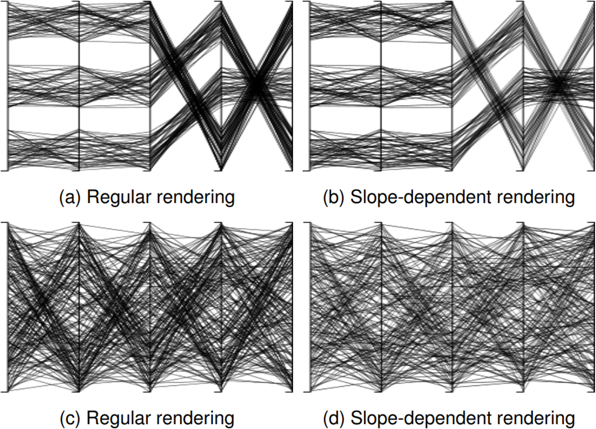
Data-informed decision-making processes play a fundamental role across disciplines.To support these processes, knowledge needs to be extracted from high-dimensional(HD) and complex datasets. Visualizations play hereby a key role in identifying andunderstanding patterns within the data. However, the choice of visual mappingheavily influences the effectiveness of the visualization. While one design choice isuseful for a particular task, the very same design can make another analysis taskmore difficult, or even impossible. This doctoral thesis advances the quality andpattern-driven optimization of visualizations in two core areas by addressing theresearch question:“How can we effectively design visualizations to highlight patterns –using automatic and user-driven approaches?”The first part of the thesis deals with the question“how can we automaticallymeasure the quality of a particular design to optimize the layout?”We summarizethe state-of-the-art in quality-metrics research, describe the underlying concepts,optimization goals, constraints, and discuss the requirements of the algorithms.While numerous quality metrics exist for all major HD visualizations, researchlacks empirical studies to choose a particular technique for a given analysis task.In particular for parallel coordinates (PCP) and star glyphs, two frequently usedtechniques for high-dimensional data, no study exists which evaluates the impact ofdifferent axes orderings. Therefore, this thesis contributes an empirical study anda novel quality metric for both techniques. Based on our findings in the PCP study,we also contribute a formalization of how standard parallel coordinates distort theperception of patterns, in particular clusters. To minimize the effect, we propose anautomatic rendering technique.The second part of the thesis is user-centered and addresses the question“howcan analysts support the design of visualization to highlight particular patterns?”We contribute two techniques: Thev-plot designeris a chart authoring tool todesign custom hybrid charts for the comparative analysis of data distributions. Itautomatically recommends basic charts (e.g., box plots, violin-typed visualizations,and bar charts) and optimizes a custom hybrid chart called v-plot based on a setof analysis tasks.SMARTexploreuses a table metaphor and combines easy-to-applyinteraction with pattern-driven layouts of rows and columns and an automaticallycomputed reliability analysis based on statistical measures.In summary, this thesis contributes quality-metrics and user-driven approachesto advance the quality- and pattern-driven optimization of high-dimensional datavisualizations. The quality metrics and the grounding of the user-centered techniquesare derived from empirical user studies while the effectiveness of the implementedtools is shown by domain expert evaluations.BibTeX
M. Blumenschein, L. J. Debbeler, N. C. Lages, B. Renner, D. A. Keim, and M. El-Assady, “v-plots: Designing Hybrid Charts for the Comparative Analysis of Data Distributions,”
Computer Graphics Forum, vol. 39, no. 3, Art. no. 3, 2020, doi:
10.1111/cgf.14002.
Abstract
Comparing data distributions is a core focus in descriptive statistics, and part of most data analysis processes across disciplines. In particular, comparing distributions entails numerous tasks, ranging from identifying global distribution properties, comparing aggregated statistics (e.g., mean values), to the local inspection of single cases. While various specialized visualizations have been proposed (e.g., box plots, histograms, or violin plots), they are not usually designed to support more than a few tasks, unless they are combined. In this paper, we present the v-plot designer; a technique for authoring custom hybrid charts, combining mirrored bar charts, difference encodings, and violin-style plots. v-plots are customizable and enable the simultaneous comparison of data distributions on global, local, and aggregation levels. Our system design is grounded in an expert survey that compares and evaluates 20 common visualization techniques to derive guidelines for the task-driven selection of appropriate visualizations. This knowledge externalization step allowed us to develop a guiding wizard that can tailor v-plots to individual tasks and particular distribution properties. Finally, we confirm the usefulness of our system design and the user-guiding process by measuring the fitness for purpose and applicability in a second study with four domain and statistic experts.BibTeX
M. Kraus
et al., “Assessing 2D and 3D Heatmaps for Comparative Analysis: An Empirical Study,” in
Proceedings of the CHI Conference on Human Factors in Computing Systems, in Proceedings of the CHI Conference on Human Factors in Computing Systems. 2020, pp. 546:1–546:14. doi:
10.1145/3313831.3376675.
Abstract
Heatmaps are a popular visualization technique that encode 2D density distributions using color or brightness. Experimental studies have shown though that both of these visual variables are inaccurate when reading and comparing numeric data values. A potential remedy might be to use 3D heatmaps by introducing height as a third dimension to encode the data. Encoding abstract data in 3D, however, poses many problems, too. To better understand this tradeoff, we conducted an empirical study (N=48) to evaluate the user performance of 2D and 3D heatmaps for comparative analysis tasks. We test our conditions on a conventional 2D screen, but also in a virtual reality environment to allow for real stereoscopic vision. Our main results show that 3D heatmaps are superior in terms of error rate when reading and comparing single data items. However, for overview tasks, the well-established 2D heatmap performs better.BibTeX
L. Merino, M. Schwarzl, M. Kraus, M. Sedlmair, D. Schmalstieg, and D. Weiskopf, “Evaluating Mixed and Augmented Reality: A Systematic Literature Review (2009 -- 2019),” in
IEEE International Symposium on Mixed and Augmented Reality (ISMAR), in IEEE International Symposium on Mixed and Augmented Reality (ISMAR). 2020. doi:
doi: 10.1109/ISMAR50242.2020.00069.Abstract
We present a systematic review of 45S papers that report on evaluations in mixed and augmented reality (MR/AR) published in ISMAR, CHI, IEEE VR, and UIST over a span of 11 years (2009-2019). Our goal is to provide guidance for future evaluations of MR/AR approaches. To this end, we characterize publications by paper type (e.g., technique, design study), research topic (e.g., tracking, rendering), evaluation scenario (e.g., algorithm performance, user performance), cognitive aspects (e.g., perception, emotion), and the context in which evaluations were conducted (e.g., lab vs. in-thewild). We found a strong coupling of types, topics, and scenarios. We observe two groups: (a) technology-centric performance evaluations of algorithms that focus on improving tracking, displays, reconstruction, rendering, and calibration, and (b) human-centric studies that analyze implications of applications and design, human factors on perception, usability, decision making, emotion, and attention. Amongst the 458 papers, we identified 248 user studies that involved 5,761 participants in total, of whom only 1,619 were identified as female. We identified 43 data collection methods used to analyze 10 cognitive aspects. We found nine objective methods, and eight methods that support qualitative analysis. A majority (216/248) of user studies are conducted in a laboratory setting. Often (138/248), such studies involve participants in a static way. However, we also found a fair number (30/248) of in-the-wild studies that involve participants in a mobile fashion. We consider this paper to be relevant to academia and industry alike in presenting the state-of-the-art and guiding the steps to designing, conducting, and analyzing results of evaluations in MR/AR.BibTeX
M. Blumenschein, X. Zhang, D. Pomerenke, D. A. Keim, and J. Fuchs, “Evaluating Reordering Strategies for Cluster Identification in Parallel Coordinates,”
Computer Graphics Forum, vol. 39, no. 3, Art. no. 3, 2020, doi:
10.1111/cgf.14000.
Abstract
The ability to perceive patterns in parallel coordinates plots (PCPs) is heavily influenced by the ordering of the dimensions. While the community has proposed over 30 automatic ordering strategies, we still lack empirical guidance for choosing an appropriate strategy for a given task. In this paper, we first propose a classification of tasks and patterns and analyze which PCP reordering strategies help in detecting them. Based on our classification, we then conduct an empirical user study with 31 participants to evaluate reordering strategies for cluster identification tasks. We particularly measure time, identification quality, and the users' confidence for two different strategies using both synthetic and real-world datasets. Our results show that, somewhat unexpectedly, participants tend to focus on dissimilar rather than similar dimension pairs when detecting clusters, and are more confident in their answers. This is especially true when increasing the amount of clutter in the data. As a result of these findings, we propose a new reordering strategy based on the dissimilarity of neighboring dimension pairs.BibTeX
D. R. Wahl
et al., “Why We Eat What We Eat: Assessing Dispositional and In-the-Moment Eating Motives by Using Ecological Momentary Assessment,”
JMIR mHealth and uHealth., vol. 8, no. 1, Art. no. 1, 2020, doi:
doi:10.2196/13191.
Abstract
Background: Why do we eat? Our motives for eating are diverse, ranging from hunger and liking to social norms and affect regulation. Although eating motives can vary from eating event to eating event, which implies substantial moment-to-moment differences, current ways of measuring eating motives rely on single timepoint questionnaires that assess eating motives as situation-stable dispositions (traits). However, mobile technologies including smartphones allow eating events and motives to be captured in real time and real life, thus capturing experienced eating motives in-the-moment (states).
Objective: This study aimed to examine differences between why people think they eat (trait motives) and why they eat in the moment of consumption (state motives) by comparing a dispositional (trait) and an in-the-moment (state) assessment of eating motives.
Methods: A total of 15 basic eating motives included in The Eating Motivation Survey (ie, liking, habit, need and hunger, health, convenience, pleasure, traditional eating, natural concerns, sociability, price, visual appeal, weight control, affect regulation, social norms, and social image) were assessed in 35 participants using 2 methodological approaches: (1) a single timepoint dispositional assessment and (2) a smartphone-based ecological momentary assessment (EMA) across 8 days (N=888 meals) capturing eating motives in the moment of eating. Similarities between dispositional and in-the-moment eating motive profiles were assessed according to 4 different indices of profile similarity, that is, overall fit, shape, scatter, and elevation. Moreover, a visualized person × motive data matrix was created to visualize and analyze between- and within-person differences in trait and state eating motives.
Results: Similarity analyses yielded a good overall fit between the trait and state eating motive profiles across participants, indicated by a double-entry intraclass correlation of 0.52 (P<.001). However, although trait and state motives revealed a comparable rank order (r=0.65; P<.001), trait motives overestimated 12 of 15 state motives (P<.001; d=1.97). Specifically, the participants assumed that 6 motives (need and hunger, price, habit, sociability, traditional eating, and natural concerns) are more essential for eating than they actually were in the moment (d>0.8). Furthermore, the visualized person × motive data matrix revealed substantial interindividual differences in intraindividual motive profiles.
Conclusions: For a comprehensive understanding of why we eat what we eat, dispositional assessments need to be extended by in-the-moment assessments of eating motives. Smartphone-based EMAs reveal considerable intra- and interindividual differences in eating motives, which are not captured by single timepoint dispositional assessments. Targeting these differences between why people think they eat what they eat and why they actually eat in the moment may hold great promise for tailored mobile health interventions facilitating behavior changes.BibTeX
M. Kraus
et al., “A Comparative Study of Orientation Support Tools in Virtual Reality Environments with Virtual Teleportation,” in
2020 IEEE International Symposium on Mixed and Augmented Reality (ISMAR), in 2020 IEEE International Symposium on Mixed and Augmented Reality (ISMAR). 2020, pp. 227–238. doi:
10.1109/ISMAR50242.2020.00046.
Abstract
Movement-compensating interactions like teleportation are commonly deployed techniques in virtual reality environments. Although practical, they tend to cause disorientation while navigating. Previous studies show the effectiveness of orientation-supporting tools, such as trails, in reducing such disorientation and reveal different strengths and weaknesses of individual tools. However, to date, there is a lack of a systematic comparison of those tools when teleportation is used as a movement-compensating technique, in particular under consideration of different tasks. In this paper, we compare the effects of three orientation-supporting tools, namely minimap, trail, and heatmap. We conducted a quantitative user study with 48 participants to investigate the accuracy and efficiency when executing four exploration and search tasks. As dependent variables, task performance, completion time, space coverage, amount of revisiting, retracing time, and memorability were measured. Overall, our results indicate that orientation-supporting tools improve task completion times and revisiting behavior. The trail and heatmap tools were particularly useful for speed-focused tasks, minimal revisiting, and space coverage. The minimap increased memorability and especially supported retracing tasks. These results suggest that virtual reality systems should provide orientation aid tailored to the specific tasks of the users.BibTeX
C. Schätzle, F. L. Denning, M. Blumenschein, D. A. Keim, and M. Butt, “Visualizing Linguistic Change as Dimension Interactions,” in
Proceedings of the International Workshop on Computational Approaches to Historical Language Change, in Proceedings of the International Workshop on Computational Approaches to Historical Language Change. 2019, pp. 272–278. doi:
10.18653/v1/W19-4734.
Abstract
Historical change typically is the result of complex interactions between several linguistic factors. Identifying the relevant factors and understanding how they interact across the temporal dimension is the core remit of historical linguistics. With respect to corpus work, this entails a separate annotation, extraction and painstaking pair-wise comparison of the relevant bits of information. This paper presents a significant extension of HistoBankVis, a multilayer visualization system which allows a fast and interactive exploration of complex linguistic data. Linguistic factors can be understood as data dimensions which show complex interrelationships. We model these relationships with the Parallel Sets technique. We demonstrate the powerful potential of this technique by applying the system to understanding the interaction of case, grammatical relations and word order in the history of Icelandic.BibTeX
F. L. Dennig, T. Polk, Z. Lin, T. Schreck, H. Pfister, and M. Behrisch, “FDive: Learning Relevance Models using Pattern-based Similarity Measures,”
Proceedings of the IEEE Conference on Visual Analytics Science and Technology (VAST), 2019, doi:
10.1109/VAST47406.2019.8986940.
Abstract
The detection of interesting patterns in large high-dimensional datasets is difficult because of their dimensionality and pattern complexity. Therefore, analysts require automated support for the extraction of relevant patterns. In this paper, we present FDive, a visual active learning system that helps to create visually explorable relevance models, assisted by learning a pattern-based similarity. We use a small set of user-provided labels to rank similarity measures, consisting of feature descriptor and distance function combinations, by their ability to distinguish relevant from irrelevant data. Based on the best-ranked similarity measure, the system calculates an interactive Self-Organizing Map-based relevance model, which classifies data according to the cluster affiliation. It also automatically prompts further relevance feedback to improve its accuracy. Uncertain areas, especially near the decision boundaries, are highlighted and can be refined by the user. We evaluate our approach by comparison to state-of-the-art feature selection techniques and demonstrate the usefulness of our approach by a case study classifying electron microscopy images of brain cells. The results show that FDive enhances both the quality and understanding of relevance models and can thus lead to new insights for brain research.BibTeX
M. Miller, X. Zhang, J. Fuchs, and M. Blumenschein, “Evaluating Ordering Strategies of Star Glyph Axes,” in
Proceedings of the IEEE Visualization Conference (VIS), in Proceedings of the IEEE Visualization Conference (VIS). IEEE, 2019, pp. 91–95. doi:
10.1109/VISUAL.2019.8933656.
Abstract
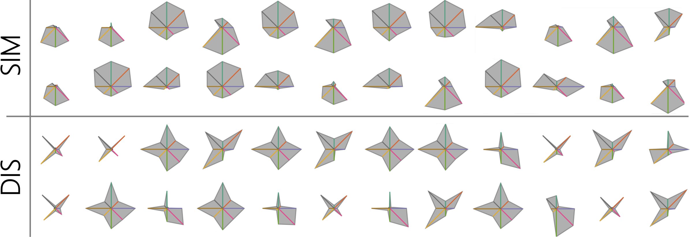
Star glyphs are a well-researched visualization technique to repre-sent multi-dimensional data. They are often used in small multiplesettings for a visual comparison of many data points. However, theiroverall visual appearance is strongly influenced by the ordering of di-mensions. To this end, two orthogonal categories of layout strategiesare proposed in the literature: order dimensions bysimilarityto gethomogeneously shaped glyphs vs. order bydissimilarityto empha-size spikes and salient shapes. While there is evidence that salientshapes support clustering tasks, evaluation, and direct comparisonof data-driven ordering strategies has not received much researchattention. We contribute an empirical user study to evaluate the effi-ciency, effectiveness, and user confidence in visual clustering tasksusing star glyphs. In comparison to similarity-based ordering, ourresults indicate that dissimilarity-based star glyph layouts supportusers better in clustering tasks, especially when clutter is present.BibTeX
D. Pomerenke, F. L. Dennig, D. A. Keim, J. Fuchs, and M. Blumenschein, “Slope-Dependent Rendering of Parallel Coordinates to Reduce Density Distortion and Ghost Clusters,” in
Proceedings of the IEEE Visualization Conference (VIS), in Proceedings of the IEEE Visualization Conference (VIS). IEEE, 2019, pp. 86–90. doi:
10.1109/VISUAL.2019.8933706.
Abstract
Parallel coordinates are a popular technique to visualize multidimensional data. However, they face a significant problem influencing the perception and interpretation of patterns. The distance between two parallel lines differs based on their slope. Vertical lines are rendered longer and closer to each other than horizontal lines. This problem is inherent in the technique and has two main consequences: (1) clusters which have a steep slope between two axes are visually more prominent than horizontal clusters. (2) Noise and clutter can be perceived as clusters, as a few parallel vertical lines visually emerge as a ghost cluster. Our paper makes two contributions: First, we formalize the problem and show its impact. Second, we present a novel technique to reduce the effects by rendering the polylines of the parallel coordinates based on their slope: horizontal lines are rendered with the default width, lines with a steep slope with a thinner line. Our technique avoids density distortions of clusters, can be computed in linear time, and can be added on top of most parallel coordinate variations. To demonstrate the usefulness, we show examples and compare them to the classical rendering.BibTeX
L. J. Debbeler, M. Gamp, M. Blumenschein, D. A. Keim, and B. Renner, “Polarized But Illusory Beliefs About Tap and Bottled Water: A Product- and Consumer-Oriented Survey and Blind Tasting Experiment,”
Science of the Total Environment, vol. 643, pp. 1400–1410, 2018, doi:
10.1016/j.scitotenv.2018.06.190.
Abstract
Background
Despite the rigorous control of tap water quality, substantial price differences, and environmental concerns, bottled water consumption has increased in recent decades. To facilitate healthy and sustainable consumer choices, a deeper understanding of this "water consumption paradox" is needed. Therefore, the aim of the two present studies was to examine health-related beliefs and risk perceptions and their accuracy by implementing a combined product- and consumer-oriented approach.
Methods
An online survey (N = 578) and a blind taste test (N = 99) assessed perceptions and behaviors for tap and bottled water within primarily tap and bottled water consumers in a fully crossed design. The combined product- and consumer-oriented approach yielded significant consumer × product interaction effects.
Results
The two consumer groups showed “polarized” ratings regarding perceived quality/hygiene, health risks and taste for bottled and tap water, indicating that the two consumer groups substantially diverged in their beliefs. However, in the blind taste test, neither consumer group was able to distinguish tap from bottled water samples (consumer perspective). Moreover, tap or bottled water samples did not systemically vary in their ascribed health-risk or taste characteristics (product perspective).
Conclusions
Although the two consumer groups differ greatly in their beliefs, the perceived health risk and taste differences seem to reflect illusionary beliefs rather than actual experiences or product characteristics. Public health campaigns should address these illusions to promote healthy and sustainable consumer choices.BibTeX
D. Sacha
et al., “SOMFlow: Guided Exploratory Cluster Analysis with Self-Organizing Maps and Analytic Provenance,”
IEEE Transactions on Visualization and Computer Graphics, vol. 24, no. 1, Art. no. 1, 2018, doi:
10.1109/TVCG.2017.2744805.
Abstract
Clustering is a core building block for data analysis, aiming to extract otherwise hidden structures and relations from raw datasets, such as particular groups that can be effectively related, compared, and interpreted. A plethora of visual-interactive cluster analysis techniques has been proposed to date, however, arriving at useful clusterings often requires several rounds of user interactions to fine-tune the data preprocessing and algorithms. We present a multi-stage Visual Analytics (VA) approach for iterative cluster refinement together with an implementation (SOMFlow) that uses Self-Organizing Maps (SOM) to analyze time series data. It supports exploration by offering the analyst a visual platform to analyze intermediate results, adapt the underlying computations, iteratively partition the data, and to reflect previous analytical activities. The history of previous decisions is explicitly visualized within a flow graph, allowing to compare earlier cluster refinements and to explore relations. We further leverage quality and interestingness measures to guide the analyst in the discovery of useful patterns, relations, and data partitions. We conducted two pair analytics experiments together with a subject matter expert in speech intonation research to demonstrate that the approach is effective for interactive data analysis, supporting enhanced understanding of clustering results as well as the interactive process itself.BibTeX
M. Blumenschein
et al., “SMARTexplore: Simplifying High-Dimensional Data Analysis through a Table-Based Visual Analytics Approach,” in
Proceedings of the IEEE Conference on Visual Analytics Science and Technology (VAST), R. Chang, H. Qu, and T. Schreck, Eds., in Proceedings of the IEEE Conference on Visual Analytics Science and Technology (VAST). IEEE, 2018, pp. 36–47. doi:
10.1109/VAST.2018.8802486.
Abstract
We present SMARTEXPLORE, a novel visual analytics technique that simplifies the identification and understanding of clusters, correlations, and complex patterns in high-dimensional data. The analysis is integrated into an interactive table-based visualization that maintains a consistent and familiar representation throughout the analysis. The visualization is tightly coupled with pattern matching, subspace analysis, reordering, and layout algorithms. To increase the analyst's trust in the revealed patterns, SMARTEXPLORE automatically selects and computes statistical measures based on dimension and data properties. While existing approaches to analyzing high-dimensional data (e.g., planar projections and Parallel coordinates) have proven effective, they typically have steep learning curves for non-visualization experts. Our evaluation, based on three expert case studies, confirms that non-visualization experts successfully reveal patterns in high-dimensional data when using SMARTEXPLOREBibTeX
M. Behrisch
et al., “Quality Metrics for Information Visualization,”
Computer Graphics Forum, vol. 37, no. 3, Art. no. 3, 2018, doi:
10.1111/cgf.13446.
Abstract
The visualization community has developed to date many intuitions and understandings of how to judge the quality of views in visualizing data. The computation of a visualization's quality and usefulness ranges from measuring clutter and overlap, up to the existence and perception of specific (visual) patterns. This survey attempts to report, categorize and unify the diverse understandings and aims to establish a common vocabulary that will enable a wide audience to understand their differences and subtleties. For this purpose, we present a commonly applicable quality metric formalization that should detail and relate all constituting parts of a quality metric. We organize our corpus of reviewed research papers along the data types established in the information visualization community: multi‐ and high‐dimensional, relational, sequential, geospatial and text data. For each data type, we select the visualization subdomains in which quality metrics are an active research field and report their findings, reason on the underlying concepts, describe goals and outline the constraints and requirements. One central goal of this survey is to provide guidance on future research opportunities for the field and outline how different visualization communities could benefit from each other by applying or transferring knowledge to their respective subdomain. Additionally, we aim to motivate the visualization community to compare computed measures to the perception of humans.BibTeX
D. Jäckle, M. Hund, M. Behrisch, D. A. Keim, and T. Schreck, “Pattern Trails: Visual Analysis of Pattern Transitions in Subspaces,” in
Proceedings of the IEEE Conference on Visual Analytics Science and Technology (VAST), B. Fisher, S. Liu, and T. Schreck, Eds., in Proceedings of the IEEE Conference on Visual Analytics Science and Technology (VAST). IEEE, 2017, pp. 1–12. doi:
10.1109/VAST.2017.8585613.
Abstract
Subspace analysis methods have gained interest for identifying patterns in subspaces of high-dimensional data. Existing techniques allow to visualize and compare patterns in subspaces. However, many subspace analysis methods produce an abundant amount of patterns, which often remain redundant and are difficult to relate. Creating effective layouts for comparison of subspace patterns remains challenging. We introduce Pattern Trails, a novel approach for visually ordering and comparing subspace patterns. Central to our approach is the notion of pattern transitions as an interpretable structure imposed to order and compare patterns between subspaces. The basic idea is to visualize projections of subspaces side-by-side, and indicate changes between adjacent patterns in the subspaces by a linked representation, hence introducing pattern transitions. Our contributions comprise a systematization for how pairs of subspace patterns can be compared, and how changes can be interpreted in terms of pattern transitions. We also contribute a technique for visual subspace analysis based on a data-driven similarity measure between subspace representations. This measure is useful to order the patterns, and interactively group subspaces to reduce redundancy. We demonstrate the usefulness of our approach by application to several use cases, indicating that data can be meaningfully ordered and interpreted in terms of pattern transitionsBibTeX
M. Behrisch
et al., “Magnostics: Image-Based Search of Interesting Matrix Views for Guided Network Exploration,”
IEEE Transactions on Visualization and Computer Graphics, vol. 23, no. 1, Art. no. 1, 2017, doi:
10.1109/TVCG.2016.2598467.
Abstract
In this work we address the problem of retrieving potentially interesting matrix views to support the exploration of networks. We introduce Matrix Diagnostics (or Magnostics), following in spirit related approaches for rating and ranking other visualization techniques, such as Scagnostics for scatter plots. Our approach ranks matrix views according to the appearance of specific visual patterns, such as blocks and lines, indicating the existence of topological motifs in the data, such as clusters, bi-graphs, or central nodes. Magnostics can be used to analyze, query, or search for visually similar matrices in large collections, or to assess the quality of matrix reordering algorithms. While many feature descriptors for image analyzes exist, there is no evidence how they perform for detecting patterns in matrices. In order to make an informed choice of feature descriptors for matrix diagnostics, we evaluate 30 feature descriptors-27 existing ones and three new descriptors that we designed specifically for MAGNOSTICS-with respect to four criteria: pattern response, pattern variability, pattern sensibility, and pattern discrimination. We conclude with an informed set of six descriptors as most appropriate for Magnostics and demonstrate their application in two scenarios; exploring a large collection of matrices and analyzing temporal networks.BibTeX
L. Merino
et al., “On the Impact of the Medium in the Effectiveness of 3D Software Visualizations,” in
Proceedings of the IEEE Working Conference on Software Visualization (VISSOFT), in Proceedings of the IEEE Working Conference on Software Visualization (VISSOFT). IEEE, 2017, pp. 11–21. doi:
10.1109/VISSOFT.2017.17.
Abstract
Many visualizations have proven to be effective in supporting various software related tasks. Although multiple media can be used to display a visualization, the standard computer screen is used the most. We hypothesize that the medium has a role in their effectiveness. We investigate our hypotheses by conducting a controlled user experiment. In the experiment we focus on the 3D city visualization technique used for software comprehension tasks. We deploy 3D city visualizations across a standard computer screen (SCS), an immersive 3D environment (I3D), and a physical 3D printed model (P3D). We asked twenty-seven participants (whom we divided in three groups for each medium) to visualize software systems of various sizes, solve a set of uniform comprehension tasks, and complete a questionnaire. We measured the effectiveness of visualizations in terms of performance, recollection, and user experience. We found that even though developers using P3D required the least time to identify outliers, they perceived the least difficulty when visualizing systems based on SCS. Moreover, developers using I3D obtained the highest recollection.BibTeX
M. Stein
et al., “Bring it to the Pitch: Combining Video and Movement Data to Enhance Team Sport Analysis,” in
IEEE Transactions on Visualization and Computer Graphics, in IEEE Transactions on Visualization and Computer Graphics, vol. 24. 2017, pp. 13–22. doi:
10.1109/TVCG.2017.2745181.
Abstract
Analysts in professional team sport regularly perform analysis to gain strategic and tactical insights into player and team behavior. Goals of team sport analysis regularly include identification of weaknesses of opposing teams, or assessing performance and improvement potential of a coached team. Current analysis workflows are typically based on the analysis of team videos. Also, analysts can rely on techniques from Information Visualization, to depict e.g., player or ball trajectories. However, video analysis is typically a time-consuming process, where the analyst needs to memorize and annotate scenes. In contrast, visualization typically relies on an abstract data model, often using abstract visual mappings, and is not directly linked to the observed movement context anymore. We propose a visual analytics system that tightly integrates team sport video recordings with abstract visualization of underlying trajectory data. We apply appropriate computer vision techniques to extract trajectory data from video input. Furthermore, we apply advanced trajectory and movement analysis techniques to derive relevant team sport analytic measures for region, event and player analysis in the case of soccer analysis. Our system seamlessly integrates video and visualization modalities, enabling analysts to draw on the advantages of both analysis forms. Several expert studies conducted with team sport analysts indicate the effectiveness of our integrated approach.BibTeX
D. Jäckle, F. Stoffel, S. Mittelstädt, D. A. Keim, and H. Reiterer, “Interpretation of Dimensionally-Reduced Crime Data: A Study with Untrained Domain Experts,” in
Proceedings of the Conference on Computer Vision, Imaging and Computer Graphics Theory and Applications (VISIGRAPP), in Proceedings of the Conference on Computer Vision, Imaging and Computer Graphics Theory and Applications (VISIGRAPP), vol. 3. 2017, pp. 164–175. doi:
http://dx.doi.org/10.5220/0006265101640175.
Abstract
Dimensionality reduction (DR) techniques aim to reduce the amount of considered dimensions, yet preserving as much information as possible. According to many visualization researchers, DR results lack interpretability, in particular for domain experts not familiar with machine learning or advanced statistics. Thus, interactive visual methods have been extensively researched for their ability to improve transparency and ease the interpretation of results. However, these methods have primarily been evaluated using case studies and interviews with experts trained in DR. In this paper, we describe a phenomenological analysis investigating if researchers with no or only limited training in machine learning or advanced statistics can interpret the depiction of a data projection and what their incentives are during interaction. We, therefore, developed an interactive system for DR, which unifies mixed data types as they appear in real-world data. Based on this system, we provided data analys ts of a Law Enforcement Agency (LEA) with dimensionally-reduced crime data and let them explore and analyze domain-relevant tasks without providing further conceptual information. Results of our study reveal that these untrained experts encounter few difficulties in interpreting the results and drawing conclusions given a domain relevant use case and their experience. We further discuss the results based on collected informal feedback and observations.BibTeX
M. Hund
et al., “Visual Analytics for Concept Exploration in Subspaces of Patient Groups,”
Brain Informatics, vol. 3, no. 4, Art. no. 4, 2016, doi:
10.1007/s40708-016-0043-5.
Abstract
Medical doctors and researchers in bio-medicine are increasingly confronted with complex patient data, posing new and difficult analysis challenges. These data are often comprising high-dimensional descriptions of patient conditions and measurements on the success of certain therapies. An important analysis question in such data is to compare and correlate patient conditions and therapy results along with combinations of dimensions. As the number of dimensions is often very large, one needs to map them to a smaller number of relevant dimensions to be more amenable for expert analysis. This is because irrelevant, redundant, and conflicting dimensions can negatively affect effectiveness and efficiency of the analytic process (the so-called curse of dimensionality). However, the possible mappings from high- to low-dimensional spaces are ambiguous. For example, the similarity between patients may change by considering different combinations of relevant dimensions (subspaces). We demonstrate the potential of subspace analysis for the interpretation of high-dimensional medical data. Specifically, we present SubVIS, an interactive tool to visually explore subspace clusters from different perspectives, introduce a novel analysis workflow, and discuss future directions for high-dimensional (medical) data analysis and its visual exploration. We apply the presented workflow to a real-world dataset from the medical domain and show its usefulness with a domain expert evaluation.BibTeX
C. Schulz
et al., “Generative Data Models for Validation and Evaluation of Visualization Techniques,” in
Proceedings of the Workshop on Beyond Time and Errors: Novel Evaluation Methods for Visualization (BELIV), in Proceedings of the Workshop on Beyond Time and Errors: Novel Evaluation Methods for Visualization (BELIV). ACM, 2016, pp. 112–124. doi:
10.1145/2993901.2993907.
Abstract
We argue that there is a need for substantially more research on the use of generative data models in the validation and evaluation of visualization techniques. For example, user studies will require the display of representative and uncon-founded visual stimuli, while algorithms will need functional coverage and assessable benchmarks. However, data is often collected in a semi-automatic fashion or entirely hand-picked, which obscures the view of generality, impairs availability, and potentially violates privacy. There are some sub-domains of visualization that use synthetic data in the sense of generative data models, whereas others work with real-world-based data sets and simulations. Depending on the visualization domain, many generative data models are "side projects" as part of an ad-hoc validation of a techniques paper and thus neither reusable nor general-purpose. We review existing work on popular data collections and generative data models in visualization to discuss the opportunities and consequences for technique validation, evaluation, and experiment design. We distill handling and future directions, and discuss how we can engineer generative data models and how visualization research could benefit from more and better use of generative data models.BibTeX
M. Hund et al., “Visual Quality Assessment of Subspace Clusterings,” in Proceedings of the KDD Workshop on Interactive Data Exploration and Analytics (IDEA), I. KDD 2016, Ed., in Proceedings of the KDD Workshop on Interactive Data Exploration and Analytics (IDEA). 2016, pp. 53–62.
Abstract
The quality assessment of results of clustering algorithms is challenging as different cluster methodologies lead to different cluster characteristics and topologies. A further complication is that in high-dimensional data, subspace clustering adds to the complexity by detecting clusters in multiple different lower-dimensional projections. The quality assessment for (subspace) clustering is especially difficult if no benchmark data is available to compare the clustering results. In this research paper, we present SubEval, a novel subspace evaluation framework, which provides visual support for comparing quality criteria of subspace clusterings. We identify important aspects for evaluation of subspace clustering results and show how our system helps to derive quality assessments. SubEval allows assessing subspace cluster quality at three different granularity levels: (1) A global overview of similarity of clusters and estimated redundancy in cluster members and subspace dimensions. (2) A view of a selection of multiple clusters supports in-depth analysis of object distributions and potential cluster overlap. (3) The detail analysis of characteristics of individual clusters helps to understand the (non-)validity of a cluster. We demonstrate the usefulness of SubEval in two case studies focusing on the targeted algorithm- and domain scientists and show how the generated insights lead to a justified selection of an appropriate clustering algorithm and an improved parameter setting. Likewise, SubEval can be used for the understanding and improvement of newly developed subspace clustering algorithms. SubEval is part of SubVA, a novel open-source web-based framework for the visual analysis of different subspace analysis techniques.BibTeX
M. Hund
et al., “Subspace Nearest Neighbor Search - Problem Statement, Approaches, and Discussion,” in
Similarity Search and Applications. International Conference on Similarity Search and Applications (SISAP). Lecture Notes in Computer Science, G. Amato, R. Connor, F. Falchi, and C. Gennaro, Eds., in Similarity Search and Applications. International Conference on Similarity Search and Applications (SISAP). Lecture Notes in Computer Science, vol. 9371. Springer, Cham, 2015, pp. 307–313. doi:
10.1007/978-3-319-25087-8_29.
Abstract
Computing the similarity between objects is a central task for many applications in the field of information retrieval and data mining. For finding k-nearest neighbors, typically a ranking is computed based on a predetermined set of data dimensions and a distance function, constant over all possible queries. However, many high-dimensional feature spaces contain a large number of dimensions, many of which may contain noise, irrelevant, redundant, or contradicting information. More specifically, the relevance of dimensions may depend on the query object itself, and in general, different dimension sets (subspaces) may be appropriate for a query. Approaches for feature selection or -weighting typically provide a global subspace selection, which may not be suitable for all possibly queries. In this position paper, we frame a new research problem, called subspace nearest neighbor search, aiming at multiple query-dependent subspaces for nearest neighbor search. We describe relevant problem characteristics, relate to existing approaches, and outline potential research directions.BibTeX